2009.02.10
The overall goal was to bring combine the spontaneity that I had on my old Palm journal (and had rediscovered with Twitter) into the daily update and archive feel of kisrael.com proper. Twitter-as-sidebar was always a bit of a hack, I could display the last X entries, there was no way for a site user to comment on a specific tweet, and I've been realizing that relying on Twitter as a permanent archive is a very dicey proposition.
I mentioned Kate pointing out the tumbleblog format to me, and the similarities with my style here. I do link thinking in terms of having an "anchored" or "slantwise" tumbleblog, though given how few people know what a tumbleblog is, it's not all that useful.
So. Designwise I had two aims:
1. Give each daily entry its own "sidebar", with quick, random thoughts updated throughout a day.
2. Remove the current site sidebar as being visually confusing by tucking it into some dropdown menus.
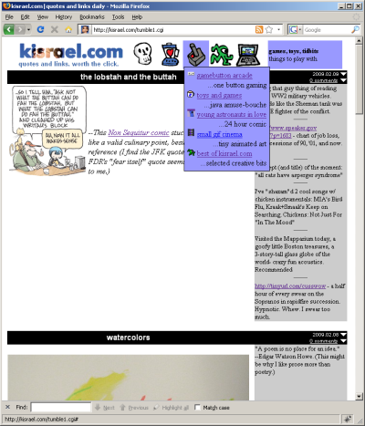
So I worked and worked and came up with this:

tumble1
I was pretty happy with the way the icons look, and the functionality of the dropdown menus (shown here - that's not what you see when the page loads) but still I despaired; the sidebar looks terrible, why couldn't I have just kept the old format entirely, just adding lots of "of the Moment"s throughout the day?
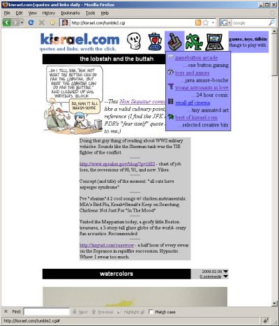
So this was my next idea:

tumble2
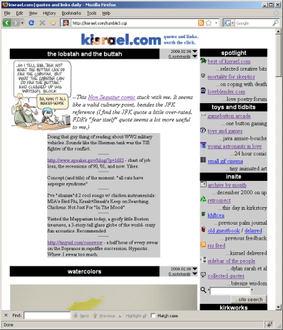
Ok, so now that I've learned quick updates go under and not to the side of the anchors, does the old sidebar have advantages in bringing potentially interesting content forward?

tumble3
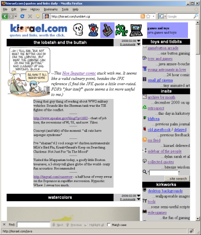
But I like my icons... they are pretty nice looking... maybe I could use them to bring more attention to the old "spotlight" stuff (half of which are technically other sites) while keeping the sidebars...

tumble4
That's not too bad. Tucking the sidebar into the icons leads to a cleaner, almost minimalist site... having the sidebar out in the open shows that I've tried to put lots of neat stuff here, that it has content beyond the tumbleblog part.
So if you get the chance, click through, or just look at the screenshots, and let me know what you find most appealing, and why. I guess I'd ask to try to look with "fresh eyes", I know that the more icon-centric, no-sidebar designs might be at a disadvantage because they are unfamilar.
"We are not water resistant" --Catholic spokesman on the increasing phenomenon of non-celibate priests
It seems like sites and services (gmail, facebook, etc) are forgetting me more often. And with all of them I signed up with a different e-mail.
Wow. A Sugar Glider might not be what you think it is. But so cute! Worth googling.
