 tag/design
2016.06.25
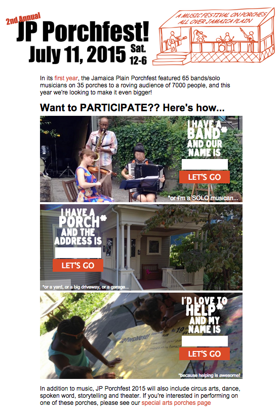
I made a print map for JP Porchfest again!

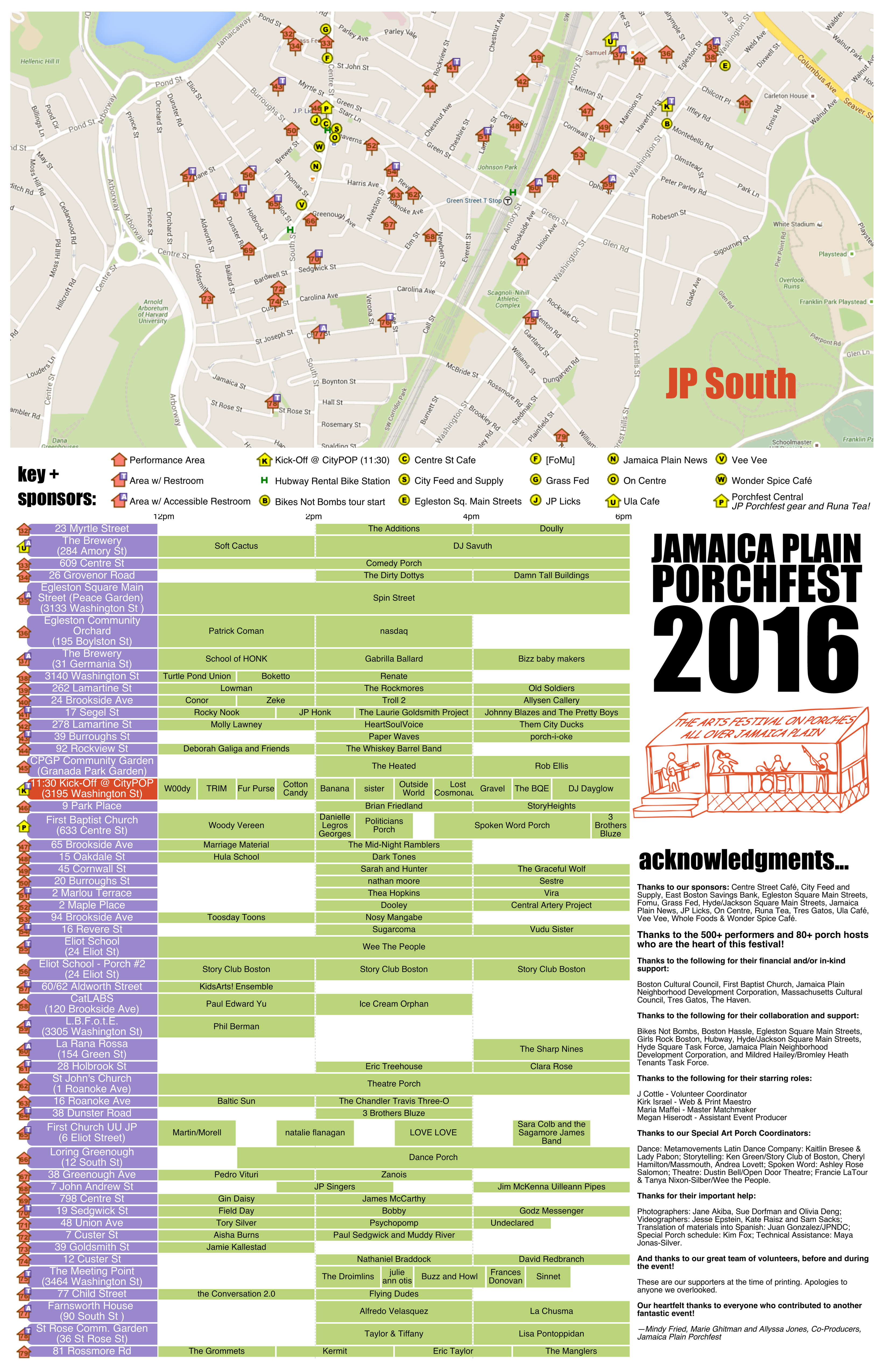
I talk about the process and compare it to last year's on my devblog.
2016.06.09
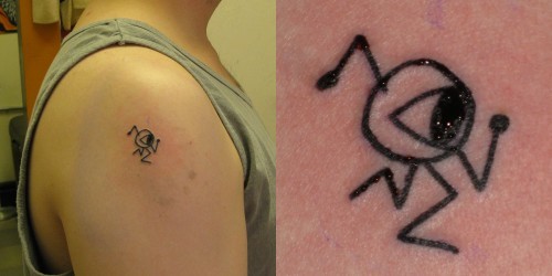
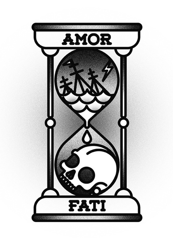
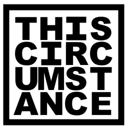
It's too soon, for now, but I've been thinking about how important and useful "Amor Fati" and the reminder to embrace - to love- this circumstance, because it is THE circumstance, is. And at least toying with the idea of getting a tattoo to represent that.
If I liked more elaborate concepts, the Bnomio design I semi-commissioned might be good:
But I've been feeling like I'm not sure I like the idea of unharmonized designs on random parts of me, so I've been toying with keeping some related, iconish designs in a column on the same arm.
This is a Processing-generated (then manually stretched) rendition of a simplification of the Bnomio I've been putting on graph paper (and it reflects those roots; maybe a more circular hour glass would look better)
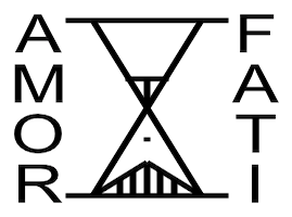
Besides the poor rendition, it's maybe a little too fatalistic and dour. Also, I'm a little biased against tattoos in languages the wearer doesn't speak. (And google has a few too many "Amor Fati"s in simple cursive script.)
Lately I've been thinking of something like this:
This is a pretty good rendition, actually, even if I'm still uncertain about the kerning... I had to fake serifs for the "I" characters, otherwise they were too skinny.
Eh, just some thoughts. Not sure if at the size I'm thinking if typeface matters, or if will have a kind of handwritten look in any event.
Willing to listen to counterarguments and criticisms. This might not be my best idea ever, but I've had worse.
Of course the other idea I flirt with is the first bar of the bassline I stole from Atari 2600 "Moon Patrol" and have been using when making music with friends ever since early highschool:
Communities organically coalescing at McDonalds. It's easy to be snobby about that place, and how "Mc-" as a prefix became a jokey signifier, but still.
Also I was thinking how "Big Macs" used to feel like, the ultimate indulgent sandwich, now they're one of the least caloric thing on their specialty burgers menu. (Which assumes cheeseburgers come in twos anyway) I had one on my way back from Connecticut the other week. It was ok.
2016.03.06
blender of love
2015.12.25
advent christmas day
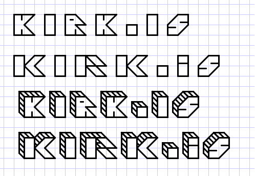
Messing around with a new logotype for http://kirk.is/ - I think I like the third one best... am thinking about making the "graph paper" background stretch at top across whole screen and then putting logotype on it, line up with the "graph paper", but over the content which will probably be fixed-width + centered.
It's fun teaching a computer to do the kind of graph paper font work I'd tool around with in high school. (See also "trifontula" http://kirk.is/2007/07/20/ ) In this case it would have been a lot easier had I not wanted to let the "graph paper" shine through.
Any suggestions?
Open Photo Gallery


2015.03.23
2015.02.11
Also I just realized this printer/scanner Amber stuck me with (Lexmark freebie with a Mac she bought, perpetually out of ink) makes a darn fine footrest!
2009.08.21
|
I've been thinking about the Logo design of the some of the toy lines of my youth. (The best image of most of these online seemed to have black backgrounds, so I'm experimenting with colors here.)
Arguably, the most notable was Transformers, Autobots vs Decepticons: 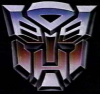

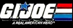
The toys all sported the badges of their particular faction, and for a while it was good, but then they added these "rub stickers", kind of heat sensitive, that were more or less opaque 'til touched. That would have been ok I guess (if a little non-sensical story-wise) but unlike normal stickers, the rub stickers were in grey boxes which were an aesthetic mess on otherwise cool robot toys. (I guess Hasbro wanted something for its toys that the knock-offs couldn't have.) Arguably the very coolest logo of the 80s was for the G.I Joe bad guys, Cobra: 
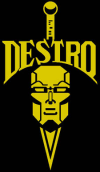
(and then of course there was the time they teamed up with the Transformers bad guys:) 
I've seen this one floating around, I don't know if it is new for the movie or what: 
I'd argue that even back in the day this kind logo work set G.I.Joe and Transformers apart from some of the other toy lines. Like, compare some of this cool iconic stuff to johny-come-lately MASK: 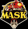
Hasbro (or whoever) kept up the canonical mask idea for later toylines, like in "Beast Wars" where it was Maximals vs Predacons: 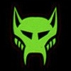

|
http://daringfireball.net/2009/08/the_android_opportunity - Can Android be saved? I worry the AppStore might make iPhone's early lead even tougher to overcome because people come to rely on specific apps.
2004.02.09
Yesterday was the NFL Pro Bowl, which I happened to catch the last half or so of. It turned into a wild game, the final score looked more like a college basketball result, 55-52. (If anyone cares: The NFC was down by 18 at one point, but the AFC kept fumbling and throwing the ball to the other team, so the NFC won it by 3.)
Anyway, now that the football season is over, someone on mefi dug up this old Salon piece In Defense of Football. It pretty much sums up why I like the sport, though I'm sure that has as much to do with me sitting though so many games in high school in college as part of the marching band.
More Football and Nostalgia of the Moment
I've heard more about the Arena Football League lately, mostly because they have a new team, the Philadelphia Soul, owned by Jon Bon Jovi, who in turns is buddy-buddy with Patriots coach Bill Belichick. I guess they've been around for almost 15 years, unlike the short-lived XFL. I dug up a list of their current teams with logos as well as the historical list (guess the teams don't always have long shelf life.)
Team names for obscure leagues has always interested me, I used to create fictional teams for a "CyberWar League" when I was a kid (including associated cities and ideas for theme-based rivalries.) I've always liked logo and presentation design. A few years ago I tried transcribing some of my old designs into Paintbrush, here were some of my favorites:
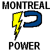
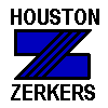
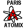
Of course, making logos and/or backstories for fictional teams is about the geekiest thing I can think of, but I'm still tempted to make up a page collecting my old ideas...
News of the Moment
How comfortable would you feel if you were on a flight and the pilot asked all Christians onboard to raise their hands? I'd be kind of worried he'd turn out to be a "Look out below, we're goin' to Jesus! Yeeeeehaw!" type. Or someone who really didn't like those infidels on his plane...
Resource of the Moment
LAN3 was looking for a player for some obscure video format, and we googled up FILExt.com, a very deep reference for every file type you can think of. (See also: file-extensions.org but it doesn't seem as complete.)
I don't care what other geeks say, that file extensions are a lousy way to label filetype, that metadata deserves it's own little doohicky instead. In practice, I think it works out really well, and lets a file be one thing of content rather than one thing plus another metathing...very convenient for web stuff especially.
Political Smudge of the Moment
You know, I don't like that Kerry's the front-runner. He reminds me too much of Dukakis, the whole Massachusetts politico vibe. I think all he really has going for him is the way his military service record stacks against Bush, and I think that stories gonna get played out well before the election.
Admittedly, I think he has more going for him in a national election than Dean, but I still think Clark (with his military authority) or Edwards (with his general friendliness, something which actually wins elections) would be a better bet. I guess a Kerry/Edwards ticket might be the best I can hope for.
2002.12.22
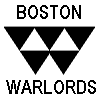
(Ok, this is incredibly geeky, but in an oddly sportsy way.) While looking at ESPN's NFL Power Rankings, I noticed certain patterns in the iconography, and decided it would be much cooler if they grouped via that, rather than geography...
Bird Head League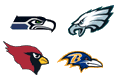
|
Mammal Head League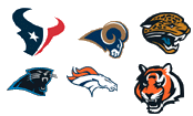
|
|---|---|
Whole Animal league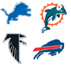
|
Words and Letters League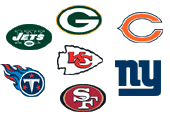
|
People Head League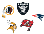
|
Icon and Thingy League |
And as long as I'm sort of ranting...ugh, between the Debeers 'I love this man, I love him I love him' buy-a-diamond-and-be-loved spot and the Lexus 'auto as perfect gift' ads...yeesh.
Essay of the Moment
On the other hand, this is one of the few pro-war "Hawk" essays that makes some kind of sense to me. The author has pretty good credentials; I hope he knows what the heck he's talking about.
Blog of the Moment
God, I don't have great faith, but I can be faithful. My belief in you may be seasonal, but my faithfulness will not. I will follow in the way of Christ. I will act as though my life and the lives of others matter. I will love.You know, I'm still always a little startled when I hear about the ministers and other believers who are Christian but don't take everything about the Bible literally. (I think a lot of Anglicans are like that, according to one survey I heard about, and the preacher in the blog mentions that's one of the things he learned about Bible scholars in his pre-seminary schooling.) I think the church in America does itself a disservice with its Fundamentalist "incorruptable and literally true" reading of its holy book. I think that's certainly something that drove me from my faith. On the other hand, from a meme point of view, maybe "the American church" is doing better for itself with this kind of simple, easy to understand, take-it-or-leave-it belief. After all, people don't seem to be getting much more rational, or equipped to judge the scientific likelihood of some of the claims of the bible.
I'm not 100% which of these camps my mom falls into. But I think she's aware of how this kind of thought has kept me from the church, and that's why she's bugged that I like to listen to Christian radio, which tends to be very fundamentalist. I listen to it because I like to argue with the radio, and it's probably not fair that that radio is so tempering my view of the religion.
2002.03.03
Ranjit pointed out SauerkrautRecipes.com as an example of "things you didn't think need their own domain name". Or their own Message Board or Club ("What other sauerkraut club would you join?") either, for that matter. The Health Info page is kind of funny...it's not actual nutrional information, just a solicitation for comments about the health benefits of sauerkraut. Ranjit considered chiming in with "My eyebrows were upside-down until I ate sauerkraut!", a concept that has been stuck in my head ever since he mentioned it...how would you tell if your eyebrows were upside-down anyway? Is there a chance that mine are and I just haven't realized it?
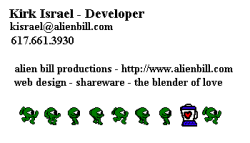
More Business Cards of the Moment
Sarah of the UK accent and great hair decided to get in on the act of making a business card for me. It looks a bit 70s to me, like the computer exhibits at Disney's Epcot...
2002.03.01
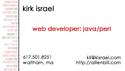
For the networking I'll need to for my jobhunt, I thought I'd print up some personal business cards. This is the design I ended up with:


Link of the Moment
Speaking of Old School, Nanoloop is a Gameboy ROM that lets you make techno on a Game Boy in realtime. Some interesting song samples here, maybe someday I should try my hand at it.