2003.02.14
I'm thinking about modifying where the comments links and stuff are... check out this page to see the design I'm playing with...prettty much the old design, but with the comment links as standalone boxes at the bottom of each entry. Sarah likes the current "tag" look (I think I do too) but Ranjit thinks comments-at-the-bottom looks good and makes more sense. What do you think? Maybe if I added some little black directional triangles to the left of the date/comment count? Also, I gotta decide if I should suppress or subvert the guestbook, I'd really prefer people use the comments system. Maybe I could have the guestbook be form as an amalgamation of all the seperate comments pages...
Funny of the Moment
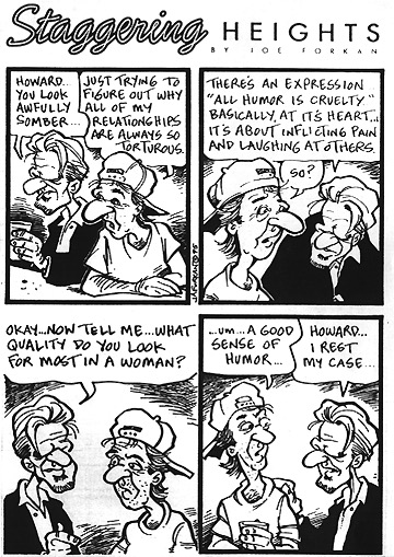
"Howard...you look awfully somber..."
"Just trying to figure out why all of my relationships are always so torturous."
"There's an expression 'all humor is cruelty.' Basically, at it's heart... it's about inflicting pain and laughing at others."
"So?"
"Okay...now tell me...what quality do you look for most in a woman?"
"...um...A good sense of humor..."
"Howard...I rest my case..."

Link of the Moment
A site called {fray} has a set of small anecdotal essays, The Things We Do For Love. If you're in a hurry, I'd suggest Things to Undo, though I don't know why I find tales of love lost more compelling than those of love found.
Arts and Crafts of the Moment
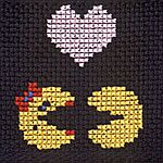
 | Classic Videogame Needlepoint. Heh! My dad was a national competition level Counted-Cross-Stitcher... I've never been tempted to try, but I'm surprised I hadn't thought of something like this before, colorful pixels and stitches go well together. |
