2011.05.15
Open Photo Gallery

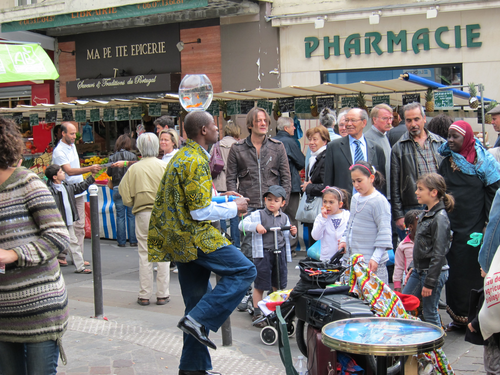
One of the first things we did was putter around our neighborhood in the 11th arrondissement, and they had a kind of amazing farmers market on the Rue d'Aligre. Including this street performer who was balancing a fishbowl on his head.

After heading back to the apartment we're renting for a nap, we headed to the museée du quai Branly. We may head back to this cultural museum and its first peoples exhibits, but for now we just got a all-Paris museum pass and then admired the greenery.

I think you may know this gal.

Tilt-shifted view from atop the Tower.. it doesn't really look like toys from up there.
Safely in Paris. loving the app CityMaps2Go-- even without paying for data roaming you can preload maps and then know where you are!
You know, from a UI perspective, toggle push buttons that change the state of a system are kind of problematic. If the current state isn't immediately clear, than it's ambiguous if a button should tell you what the current state is, or what the state will change to if the button is pressed.
For example, my cellphone has a virtual button "Speaker On", and if the other person isn't talking, I don't know if that means the speaker is on, or will turn on if I press that button.
I see this a lot with music players... there's the convention of the right pointing triangle for "play" (and a square or two vertical lines for "pause") but often it's a guess if it means "playing" or "play".
