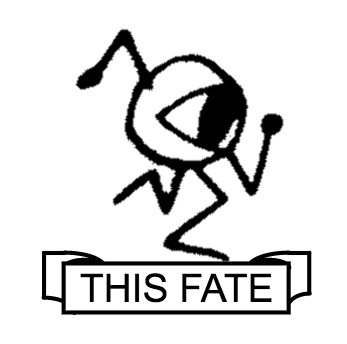
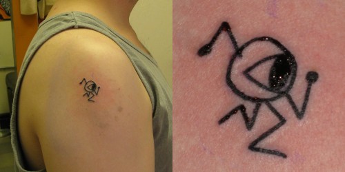
 tag/tattoo
2016.08.28
@ The Worcester Palladium, going to see Thomas Sanders

2016.06.09
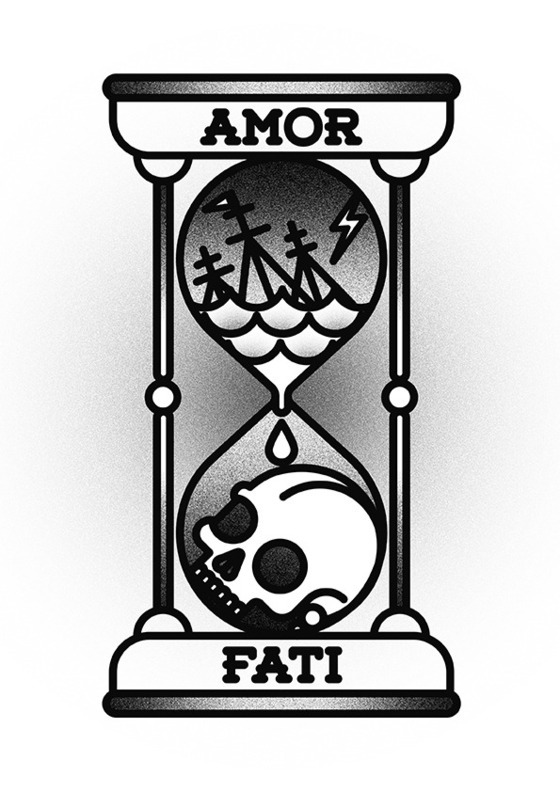
It's too soon, for now, but I've been thinking about how important and useful "Amor Fati" and the reminder to embrace - to love- this circumstance, because it is THE circumstance, is. And at least toying with the idea of getting a tattoo to represent that.
If I liked more elaborate concepts, the Bnomio design I semi-commissioned might be good:
But I've been feeling like I'm not sure I like the idea of unharmonized designs on random parts of me, so I've been toying with keeping some related, iconish designs in a column on the same arm.
This is a Processing-generated (then manually stretched) rendition of a simplification of the Bnomio I've been putting on graph paper (and it reflects those roots; maybe a more circular hour glass would look better)
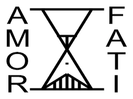
Besides the poor rendition, it's maybe a little too fatalistic and dour. Also, I'm a little biased against tattoos in languages the wearer doesn't speak. (And google has a few too many "Amor Fati"s in simple cursive script.)
Lately I've been thinking of something like this:
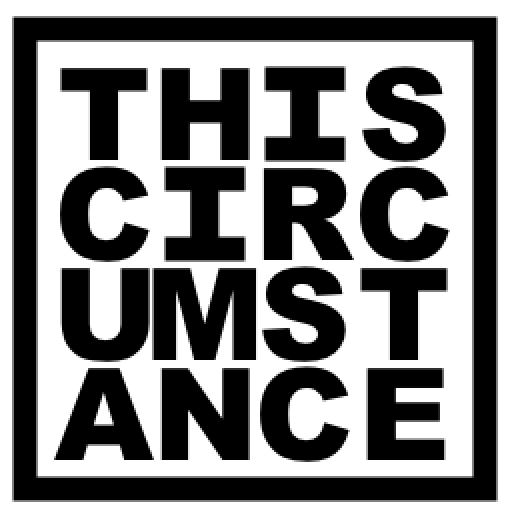
This is a pretty good rendition, actually, even if I'm still uncertain about the kerning... I had to fake serifs for the "I" characters, otherwise they were too skinny.
Eh, just some thoughts. Not sure if at the size I'm thinking if typeface matters, or if will have a kind of handwritten look in any event.
Willing to listen to counterarguments and criticisms. This might not be my best idea ever, but I've had worse.
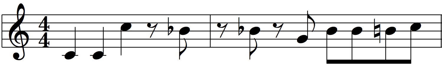
Of course the other idea I flirt with is the first bar of the bassline I stole from Atari 2600 "Moon Patrol" and have been using when making music with friends ever since early highschool:
Communities organically coalescing at McDonalds. It's easy to be snobby about that place, and how "Mc-" as a prefix became a jokey signifier, but still.
Also I was thinking how "Big Macs" used to feel like, the ultimate indulgent sandwich, now they're one of the least caloric thing on their specialty burgers menu. (Which assumes cheeseburgers come in twos anyway) I had one on my way back from Connecticut the other week. It was ok.