2015.10.20
Anything a writer disowns is of interest, particularly if it’s a frivolous thing and particularly if, like Amis, you take seriousness seriously.On a whim I bought a copy of this hard to find book (I think I paid a bit over $100 for it a few years ago; currently the one copy listed on Amazon is going for north of $500) Recently I undid the binding of my copy and scanned it in and sent it to Anna Anthropy for Annarchive, her repository of old shareware and other video game historical artifacts- you can download the full copy there, and it's kind of an amazing piece, though as Anna points out full of casual homophobia, racism, and a surprising amount of references to child prostitution.
But there's also overwrought gameplay advice prose like this for Pac-Man:
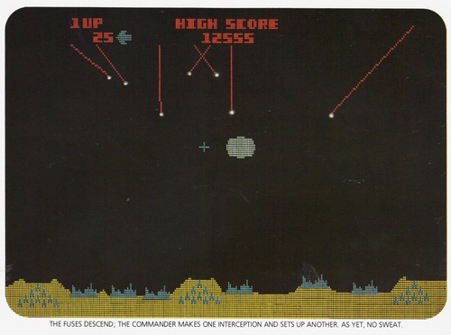
Do I take risks in order to gobble up the fruit symbol in the middle of the screen? I do not, and neither should you. Like the fat and harmless saucer in Missile Command (q.v.), the fruit symbol is there simply to tempt you into hubristic sorties. Bag itand
PacMan player, be not proud, nor too macho, and you will prosper on the dotted screen.There was another great quote:
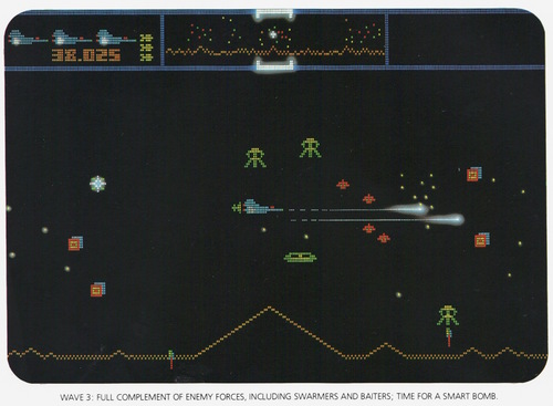
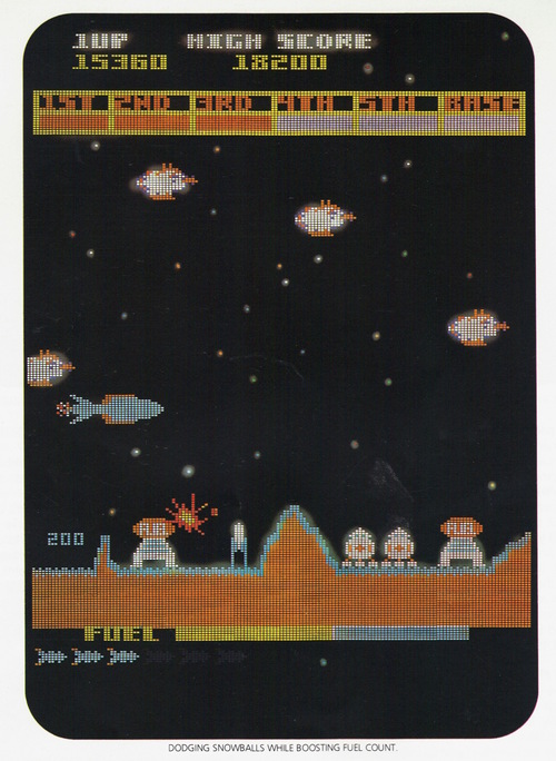
"That seems to be the psychology behind Atari. You can never win, and you always can get better."Besides the prose (and referring to Steve Jobs as "Atari's Steve Jobs") what I find most striking about the book are the obviously reconstructed screenshots. I guess in an era where video games were tough to photograph (presumably in smoky arcades with cranky owners) it made sense to hire graphic artists to recreate the shots... sometimes that can be done for artistic effect (like all those Activision boxart screenshots) but my feeling is these were made to look relatively authentic (and I left out a few actual screenshots they included, like for Frogger and Turbo.)
Open Photo Gallery
Centipede probably first made me think about how odd the "screenshots" were, because Centipede seems to have been travelling back up, something that can never happen in the game: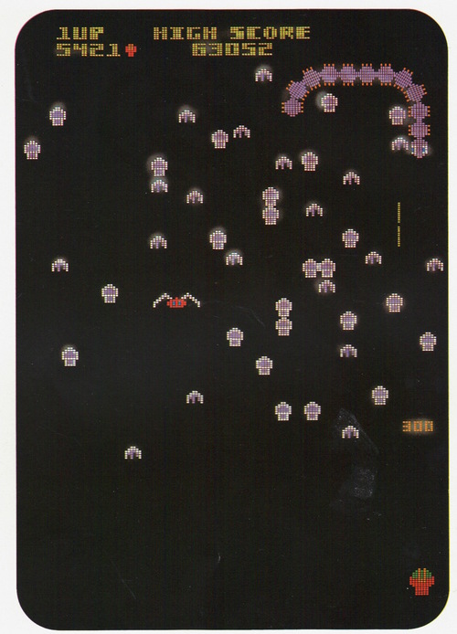
Other shots had distinctive tells, like the wall-eyed enemies in its take on Pac-Man:
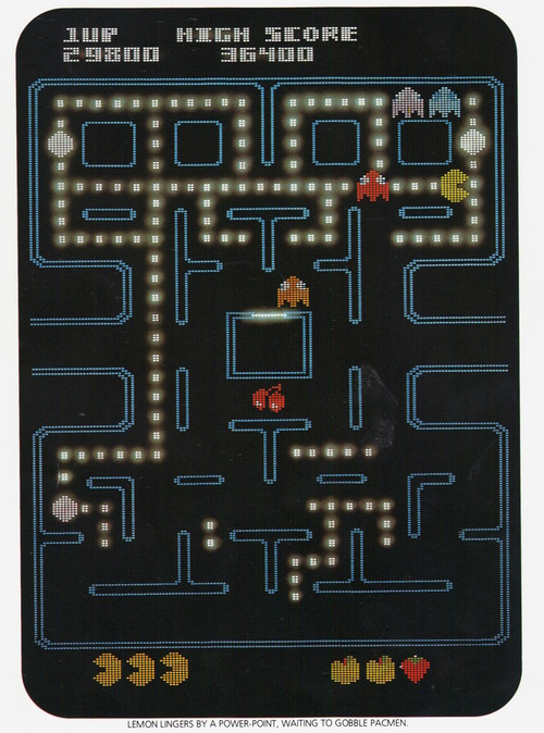
Actually, Pac-Man is especially jolting because he (semi-charmingly) calls the enemies "The PacMen" and the player's character "The Lemon", or more specifically "the dot-munching Lemon that goes whackawhackawhackawhacka". (To be fair, there has long been some confusion if the enemies are "monsters", "ghosts" or "ghost monsters".)
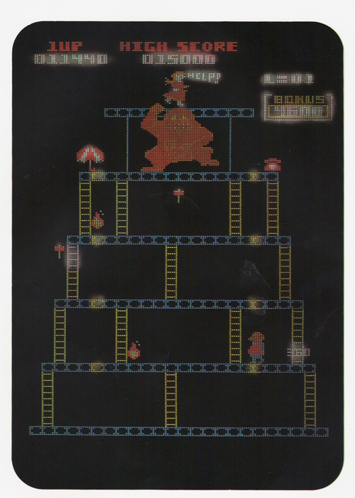
Their Donkey Kong interpretation has the Jumpman bald and sans cap.
The book has a lot of other incidental art as well...
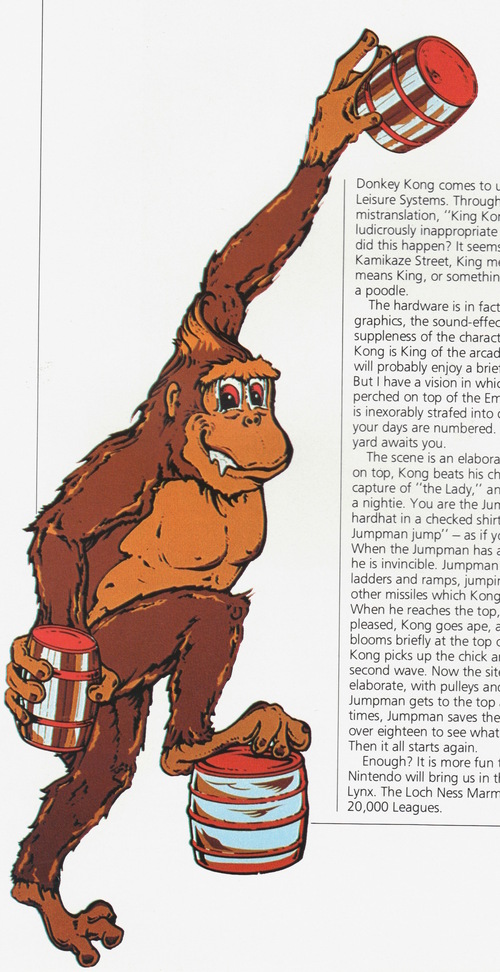
That's kind of an early example of a long tradition of "Donkey Kong not looking quite like he does on the arcade game itself".
The remaining examples are all space shooters or similar:
Defender:
Missile Command:
Scramble:
Pleiades:
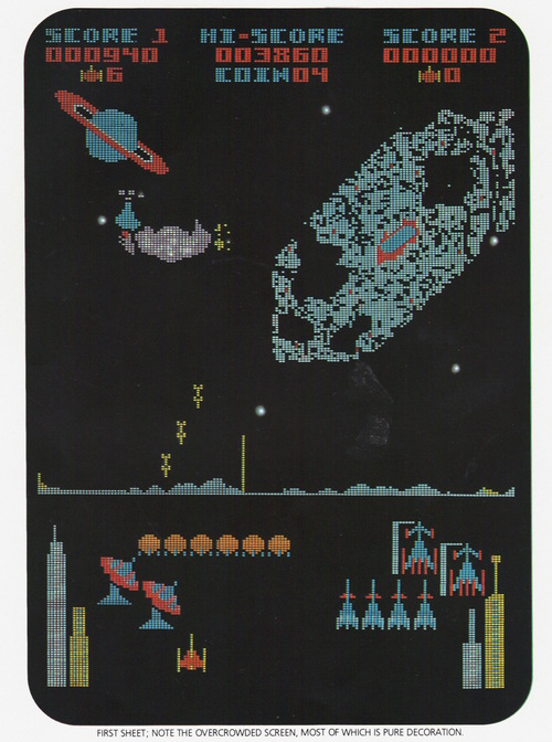
Galaxian:
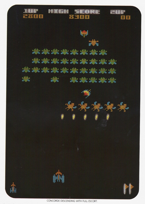
Gorf:
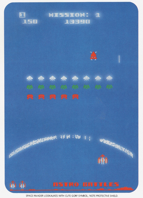
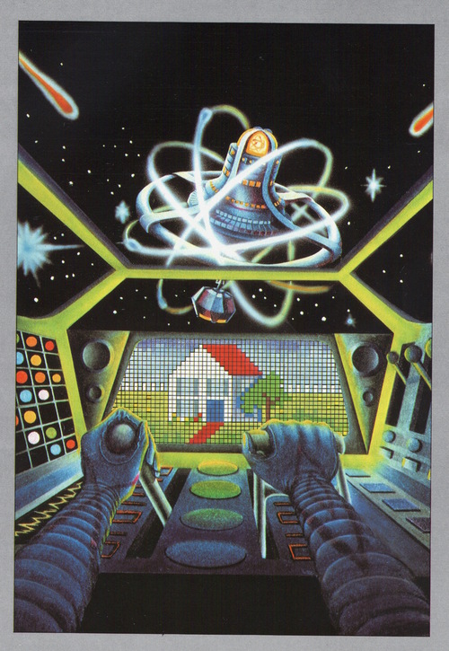
Other random art... I sort of like how this one implies the spaceship pilot might be longing for a home planet, or maybe just bringing forth the idea the space station IS home:
And to end with the beginning, we'd be amiss not mention the Amis cover:
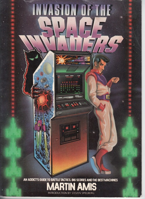
The amount of snark in that guy's stance is impressive (PS: Introduction by Steven Spielberg! Strange times.)
Also:
