2011.04.07
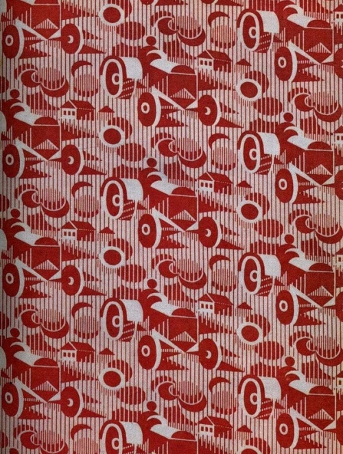
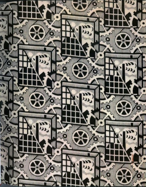
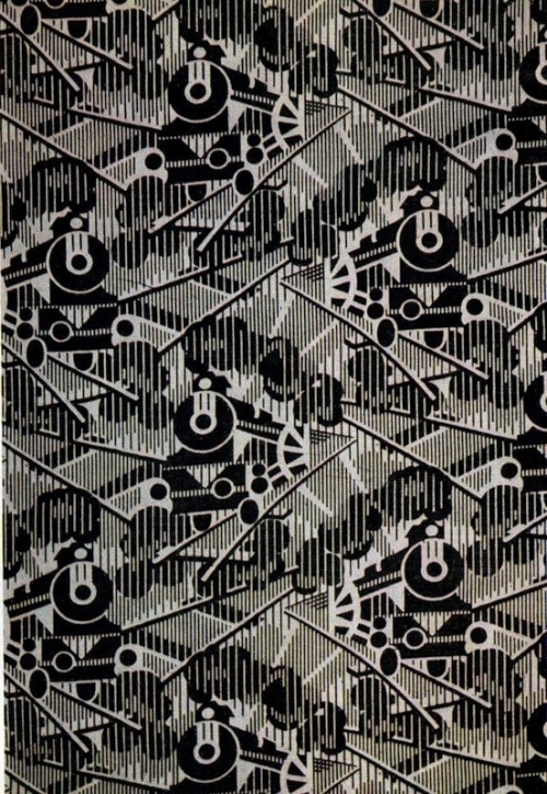
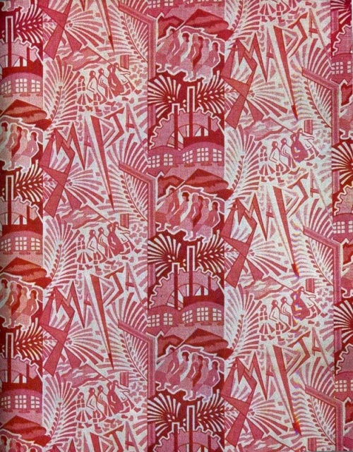
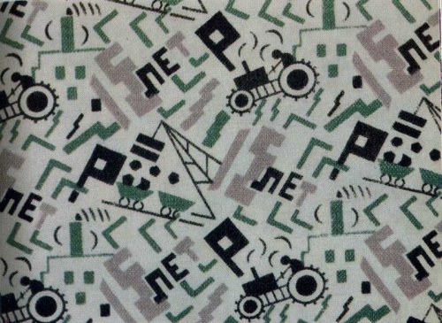
Clearly we need more tractor-based textiles in our lives!
All programmers are playwrights and all computers are lousy actors.
the end is nearer
The visual design of the iPhone app icon communicates that it is like a little physical pebble. Unlike other platforms, iPhone icons have no negative space. Every icon has the same solid shape. They can optionally have a gloss, which is applied by UIkit and on by default for developers, and the uniformity of this lighting effect across many icons further reinforces the effect.Some astute analysis. It's just one aspect of physicality and kinetic feel that Apple is doing so well with these devices...
I feel like I could take all my apps and put them in a little bag and carry them around. Just like the collection of marbles I had as a kid. There is something viscerally satisfying about the physicality of those little app icons.
You may be thinking you're too sophisticated to be influenced by this, but I'm pretty sure we humans haven't evolved as fast as our technology over the last few decades.
