2015.12.25

advent christmas day
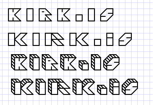
Messing around with a new logotype for http://kirk.is/ - I think I like the third one best... am thinking about making the "graph paper" background stretch at top across whole screen and then putting logotype on it, line up with the "graph paper", but over the content which will probably be fixed-width + centered.
It's fun teaching a computer to do the kind of graph paper font work I'd tool around with in high school. (See also "trifontula" http://kirk.is/2007/07/20/ ) In this case it would have been a lot easier had I not wanted to let the "graph paper" shine through.
Any suggestions?

