2019.12.26
Background: When I'm playing with BABAM or JP Honk, I have banners I put over the bell of my tuba to give the name of the band or to write on with magic marker the message of the event BABAM is backing - it makes my horn less pretty but it's useful billboard space.
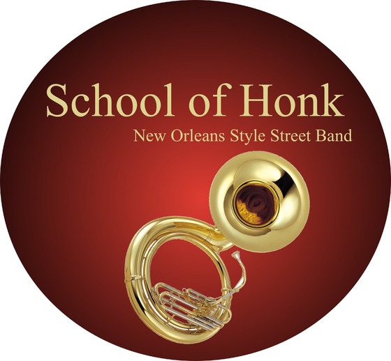
But this morning, I had this weird nightmare where School of Honk was asking ALL the tuba players to use a banner like this one - this tacky rich red, bad serif font, photo of a tuba... this is the best I could do to reconstruct it.
OK, "really bad choices in brand identity" is probably pretty low on the list of worthy nightmare topics BUT STILL. I woke myself up enough to write it down...


--Metroid II From this utterly amazing collection of (usually looping) animated video game screenshots...
