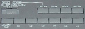
Strike Two: I could not figure out how to set the alarm. It's as if they worked to make the button labels as unhelpful as possible...not only that, but it's easier to set the time than the alarm. The rocker switch on the front is labeled both tune up/down and hours/minutes, so obviously it has something to do with it. But none of the other button labels said 'set' or 'alarm'. Now, hitting 'MODE' seemed promising, because on the front panel it started flashing 'SET ON'. Hitting the hour/minutes button did nothing though. This is when I had to download a PDF copy of the manual. It turns out to set the alarm you have to also hold MEMORY/TIME down. Now, since that button on the front does double duty for tuning and time setting, it makes sense that you have to hold down another button or the clock has to be in 'set mode'. But both? Why is that? A little experimenting reveals the answer'if you hold MEMORY/TIME down and press the front button when not in 'set mode', you change the time. Not the alarm, the time. That means it's about twice as easy to change the time than to change the alarm. Now, which one do you think people do more often?
My college roomie Brian used to add or subtract hours to the time setting of his alarm clock rather than change the alarm time itself. For years I assumed he did it because of a sense of surreal-ness it added to everything. Now I'm wondering if he had a clock as user hostile as mine.
Strike Three: If there's one thing an alarm clock should do, it's wake you up on time. This clock has a little icon on the front panel. When you hit the [ALARM] ON/OFF button, this icon goes on and off. One might assume that this means the alarm is on, or that the alarm is off, accordingly. No. Because, see, if that switch on the left is on [RADIO] OFF, your alarm clock will not wake you up for love nor money. It might display its little alarm icon, lulling you into a false sense of security, but next morning that radio will not play. The stupidity of this design overwhelms me. I can see the half-assed logic (wanting to separate turning the alarm off in the morning from just hitting snooze) but' jeez. Your clock shouldn't lie to you.
For the exact same manufacturing costs, I could've designed a better UI than this. Just making labels less misleading would be a start. (I still don't know what '+5' does.) Changing a few behaviors (making it easier to change the alarm than the time setting, not showing the alarm icon if the alarm is turned off because of the switch) would be even better. Changing a few more electronic readouts could actually make it intuitive!
Anyway.
I hate to sound like a curmudgeon about this thing, but it really is bad. I'll try to justify my rant with this next quote:
Quote of the Moment
If people were going to use computers all day, everyday, the design of such machines was not solely a technical problem-- it was also an aesthetic one. A lousy interface would mean a lousy life.
News of the Moment
Salon article: Judge rules no webcast of McVeigh's execution. Now I'm against the death penalty. But if you're going to go for it, you should really go for it. Don't try to pretend there's some kind of dignity here. Go full tilt for the bread and circuses. If the people demand revenge in cold blood, give it to them! In full color! And Dolby Stereo! On national tv! Really get that "deterence" message out there!
