 tag/tech
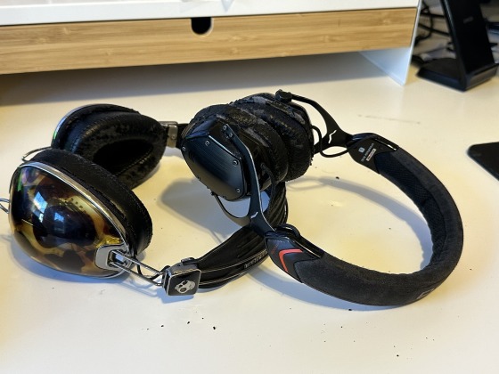
I still think no wireless headphone or earbud has the dignity of something with a cord. Headphones look like earmuffs, airpods look like you're sticking cigarettes in your ear, the semi-wireless buds I prefer (that turn into magetic-front-claspe necklace when not in use) look like a librarian's eyeglass chain.
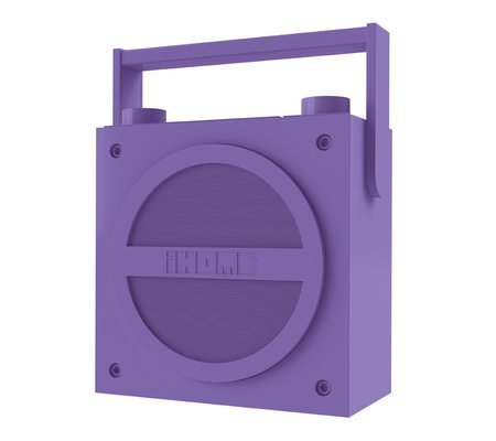
They also made a "boom box" style version of it:
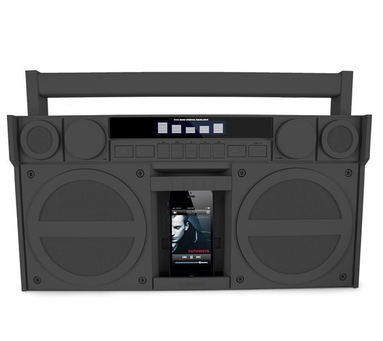
The design of both was quite appealing in an artsy retro and "Museum of Contemporary Art" way - but there's something weird about the coating they used that over time it becomes a gross and sticky/tacky.
For Christmas Melissa got me the SEVIZ Four off of my wishlist so I can retire the iBT4. (I've noticed even cheap BT speakers have gotten much, much better over the past few years, much richer sounds, so I think it will be an upgrade in the audio department. And both have an FM radio, which seems like a nice backup for information even in an age of podcasts.)
Still, it was a really cool design!
Thanks to Adam and everyone who helped set up some great talks the other week!
I was so glad I shook off an urge to lose myself in my kindle until the "real" talks began - we have a nugget of this great little community doing really cool work here, and I'd love to see more - both what people are doing (like in the other thread) and also stuff, obscure or well-known, old or recent, that they think other Tech Poets should be aware of.
Zach Lieberman's work reminded me of two other artists I wish more people knew of: Some of his overhead projector / shadow stuff reminded me of Myron Krueger - he was working on amazing interactive stuff, most often w/ realtime silhouette / shadow data, and he started doing that when, like, "Pong" was the new hotness - but with a fervent dedication to keeping things real time. You can see a decent overview of some of his stuff here:
(Zach showing us Chris Sugrue's "Delicate Boundaries" was such a lovely extension of some of those ideas)
I like to see where ideas like these, either descendents or parallel thoughts, get commercialized. Way back in the PS2 era, "EyeToy" had some elements of that, of using simple webcam data to let you, say, fight off a big group of tiny ninjas leaping on you Maybe too this is all on my mind because I just got one of those PS4 VR setups, and some of the mini worlds play with some similar ideas...
At some point Zach was showing clips from software where people would draw something in a space, and that drawing would take on some kind of life - this reminded me of Takeo Igarashi's work.
He came up with this concept he called T.E.D.D.Y for making 2D sculptures by extrapolating from simple 2D doodles -
This got put into AMAZING commercial life with a game called "Magic Pengel". This was a PS2 joint project with Studio Ghibli (!!) and you didn't just draw static things, but fighting critters - as you drew, you indicated if this was a leg, or a wing, or a tail, or what, and then some super clever code animated what you drew and put it dancing and weaving in 3D space. Quite amazing! Unfortunately, the combat was just Pokemon-like Rock/Scissors/Papers turn-based battles. (A sequel, "Graffiti Kingdom", tried to make the creation system less loose and more engineer-y, I don't think it was an improvement.) Here is a Lets Play:
And while that video has loose, clay-lump drawings, apparently the sky was the limit in the hands of a skillful, determined artist:
I'm just blown away by this stuff. Going back to 2D, there was that "Crayon Physics" type games, and I see some more recent "2D physics from doodles" - but this 3D stuff was totally next level, and I'd love to see it in more applications - T.E.D.D.Y really bridged a gap from 2D inputs to 3D sculpture, and I don't even know what kind of black magic and animation genius about joints and physics Magic Pengel employed - I'd love to see a "Smash Bros" type physical combat with this idea (but I'm nowhere near smart enough to make it)
So what have you seen, either in the artists studio or gallery or on the store shelf (virtual or otherwise) that inspires you? What stuff based on Ollllld technology still inspires that "damn, how'd they do THAT?" And where would you like to try and put it in your own work?
For those of us of a certain age, a BASIC prompt was what you’d expect to see when you turned any computer on.This article is the best I've read on the subject (marred slightly by the amount of ads on the page) In particular, I hadn't realized how important it was as computers moved from the batch process punchcard era to the expectations of real-time interaction we enjoy today - and of getting students to realize that programming was something that mere mortals could do.
That was in the 60s - in the 80s, BASIC was the bedrock of home computers - and most kids were given a chisel and some other basic tools so that if they were motivated, they could get the computer to do whatever they wanted.
The article briefly touches on BASIC's detractors. But as my friend Jeremy Penner (founder of everyone-can-and-should-make-games celebration site Glorious Trainwrecks ) mentioned to me, line numbers, while limiting in many ways, are a super intuitive way to get a kid making that first step of "computer programs tend to go step by tedious step". I think Dijkstra infamous complaint "It is practically impossible to teach good programming to students that have had a prior exposure to BASIC" is way out of line; understanding simple step by step flow does not preclude later learning of modularity and other more sophisticated topics.
As Harry McCracken writes:
BASIC was so approachable that you could toss off little improvisational programs with barely any effort at all. I probably wrote hundreds of them in my high school’s computer lab—games, utilities, practical jokes to play on my classmates. Most were meant to be disposable, and unless any of them show up on forgotten floppy disks at my parents’ house, almost all of them are long gone.That hit home for me. In the 2000s, that's sometimes my style for stuff in Processing and P5.js (though I'm a bit of self-absorbed nerd so I archive "the good stuff" at toys.alienbill.com.) Other people I know, like Anna Anthropy write books about writing your own games in Twine, Puzzlescript, and Scratch.
But it's still a long way from the "booting into BASIC" days - Mac/Windows/Phone environments are great program launchers, but don't have that ramp into "you type things and computer stuff happens!" Also, the gap between "real" programs and what an amateur can write is MUCH bigger than it was in 1980s - especially for games. "Casual" games are a welcome exception to that, but a beginner programmer usually isn't using a toolset for 3D stuff.
(An upcoming thing I'll be keeping an eye on is Dreams for PS4 - "a space where you go to play and experience the dreams of Media Molecule and our community. It’s also a space in which to create your own dreams, whether they’re games, art, films, music or anything in-between and beyond." That's the same folks who made LittleBigPlanet which had a pretty rich online maker community too, so it'll be neat to see what comes of it.)
A sign you're becoming an adult is when you watch a movie and you stop seeing yourself as the protagonist and start seeing yourself as one of the minor characters.
Thinking how FB offers "plausible deniability" when some issue seems too complex or fraught to provide a compassionate response. Like, maybe the algorithms didn't choose to show it to me, that's why I made no comment.
Open Photo Gallery
Marching with City Life / Vida Urbana to protest ghoulish landlord shenanigans--

Soldiers in reanimated skeleton armies would probably have to use sign language.
A few weeks ago at the Maker's Fair at the Boston Children's Museum:

I like getting custom-made ones with art by Jame Harvey - the indie artist who has done work fo DC, as well as my own comic on mortality. Here they are:
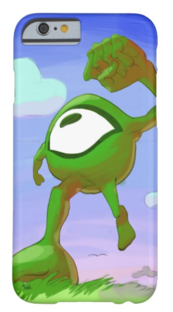
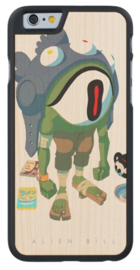
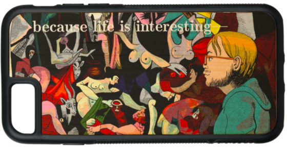
And here's the latest (first one where I didn't technically commission the art, though I helped fund the Kickstarter...
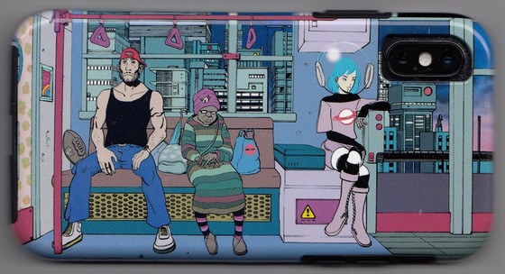
Of course, lock screens can be pretty hip too... the new one on the right is a zoom in of a poster I ordered from him when he was doing freelance commissions:
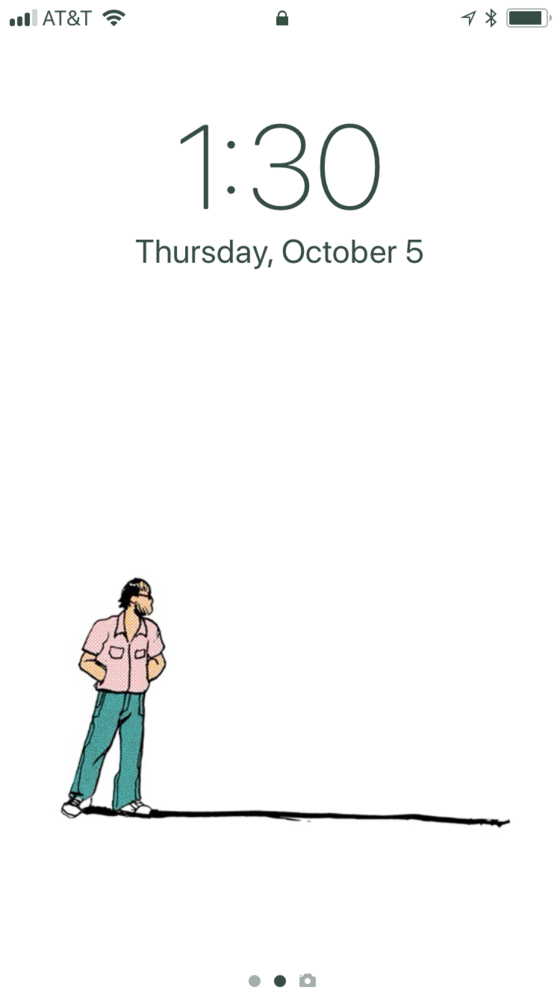
I also made a wallet or two.
The cases were mostly ordered from zazzle. For what it's worth, two of those cases were wooden, which I wouldn't recommend if you need it to last more than a year.
Allegedly Japan still has a big love for the format - https://qz.com/711490/why-japan-has-more-music-stores-than-the-rest-of-the-world/ - though some people on the ground via Quara don't seem to agree.
CDs were the pinnacle of album technology. As a guy who never acquired a taste for albums as more than a somewhat arbitrary collection of songs, I don't miss 'em that much, though after ripping my collection en masse I kept a bunch for years (in 4 massive black binders, with the booklets carefully included too)
Thinking about shuffle - I remember some CD players would offer shuffle, and some of those 3 or 5 disc carousel beasts would even do it across disks, though the wait between songs (clunk, whirrrrrrrr, clunk, spinnnnnn) was silly. Actually in terms of interacting with music, those carousels were weirdly unique, right? With LPs and cassette tapes and most CDs, each album stood alone, you physically got it off the shelf or rack, prepped it, and played - a bit of ritual, especially with vinyl... CD carousels invited a few attempts to optimize, like maybe you'd put in the next CD while the current one was playing (tricky! - sort of like ordering a series of songs on a jukebox) or you'd keep a couple of really loved particular CDs loaded in the other ones at all times, for fast-switching... mostly it was a mess. (Oh and some people had a similar multi-CD player for their car... though the ones where you'd have to go to the trunk/boot to swap seemed a lot weirder and less convenient to me than the traditional single disc reader in the console model.)
CDs also have a special relationship to mixtapes. Some of it was timing in my life, but in general CD to tape mixtapes were more common than tape to tape or LP to tape. Being able to make a custom playlist was empowering. (Hm, actually when I assemble playlist like things now, whether for listening, or even in picking numbers for my street band to play in a show, I much prefer alternating paces. Maybe that preference for back to back diversity and contrast is why whole albums seemed less pleasurable to me.)
Final nostalgia tinted analysis: for a while it was cooler to have a CD player than a tape deck in your car, at least once it was more or less affordable to burn mix CDs. But then when all music was in mp3s on a device, it was better to have a tape player so you could use of those funky adapters, since it took a while for car makers to put in an aux input, or (now) USB port.
Man, had not thought about all this physicality in music for a while - so much of it so particular to rather brief eras!
(and lets not talk about 8-tracks :-D )
Free Vintage Posters, guess they lapsed ito the public domain- cool stuff

here's the comment:
In some ways it seems unfair, because the jury is still out on Gates, but certainly his foundation is out to make some awesome change.
In terms of "computers to the masses"-- the thing is, maybe there's more a feel of inevitability of what he did? IBM decided to make a "Personal" computer, risking their golden goose of big hardware to make sure they didn't get left behind home computers. (Which, come to think of it, was primarily the Apple II) Gates was savvy enough to catch that train with super clever licensing of someone else's DOS... but someone would have done that if he didn't? Similarly, it seems likely some form of Xerox -> Macintosh WIMP interface would have gained traction in the 90s on PCs even in a Gateless world.
So looking at what Gates did, it was that clever licensing where he could make money selling DOS to PC clone manufacturers... that was the world changing bit, perhaps? This was all in the wake of the Great Video Game Crash of 1983, which provided a window for Home Computers to really take off. But the Apples and Commodores and Atari 8bits (while running rings around PCs in terms of fun, graphics and sound) lacked the gravitas of IBM for business. So it was a combination of the reputation of IBM, Gates clever licensing, and good ol' free market competition on the hardware that pushed to make computers so ubiquitous.
But Jobs did more at the leading edge of technology -- all with a little (lot of) help from his friends. With Woz, the Apple II made the home computer happen. With Xerox, the Macintosh brought WIMP UI to the peoples. Jump forward 2 decades, and he made the next level of touch screen computing on ubiquitously connected devices occur. Jobs led Gates et al on all these things.
From the first world perspective then, Jobs without a doubt - if Gates hadn't existed, someone would have done most of the same stuff, but Jobs changed things with a personal vision and sense of design. (who knows, maybe a world where IBM clones hadn't strangled the market in the 80s and 90s, with a richer variety of products from Amiga and Atari and others, would have been cooler?) From a global perspective, the Gates Foundation will really help more people, with the focus on medicines and education. So is that "influential"? Maybe. Mostly it was one great idea, licensing the software so the hardware could have competition, that made him a ton of money, and that he then turned into helping people.
(Side note, it's interesting thinking of that summary and, say, the launch of Windows 95, and the INSANE amounts of testing of Win 3.1 software they did, and the hacks they put in place, to ensure that no one would have "well my program doesn't work on the new system" as an excuse not to upgrade. That was a consequence of "Microsoft on All Hardware". It's also important to remember how untouchably powerful Microsoft seemed in the late 90s, that they had enough cash to buy anyone who seemed like a threat. Luckily, they never saw the threat the Internet would be...)
Let me explain. For some of us, it is hard to hear 'I love you' - because to us, it suggests you don't know us as well as we'd hoped.
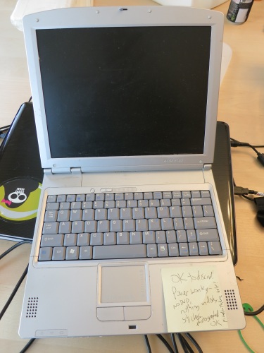
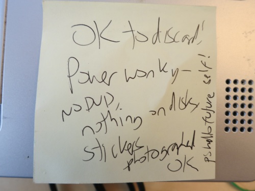
I liked the post-it I had written about some time ago-- apparently my past-self knew my future self all too well...
Something's wrong
When you regret
Things that haven't happened yet.
The main things which seem to me important on their own account, and not merely as means to other things, are knowledge, art, instinctive happiness, and relations of friendship or affection.
Don't be both Homer and Odysseus--at least not at the same time.
When you make a mistake on the trumpet, make it a big one.
The Rise and Rise of Javascript; I need to get into node.js and underscore.js looks intriguing...
http://kirkdev.blogspot.com/2011/12/osx-vs-windows-redux.html -- UI dev ramble on Win vs OSX modifier keys, fun fun fun!
There's some luck in every good thing that you earn. Gratitude can't be optional.
The iPad has super shitty, well nigh non-existent, bulk image select for deleting, nor anything in solution. #applefail #gimmethe4gigsback

$8.5 billion for Skype? Man, and I thought Ebay got ME to overpay for stuff...
http://is.gd/7IaG3I - Secret Service Twitter!
This is the main review I've read. Conceptually I dig the stark, uber-minimalist no-stickers-whatsoever case, but beside that, this thing seems as boring as possible. To quote the review:
I have to keep reminding myself of the OS' fundamental concept: a Chrome OS notebook is absolutely zero-percent different from any Windows, Mac OS, or Linux notebook running Google Chrome in fullscreen mode.So, if my disdain for the Cr-48 is shortsighted, it would probably be because I'm downplaying the potential coolness of the Chrome App Store -- is it possible that this could become as intriguing as the Apple App Store? My guess is no... iDevice apps get a boost because they are touchscreen at their heart, and based on what I was saying yesterday, I think that's an important difference that will last even after the novelty has worn off.
So we have a boring, browser-only laptop: the difference is, this laptop is an experiment in Life on the Cloud: none of your files are stored locally, they live on the 'Net.
This seems like yet another attempt to make dumb terminals cool. And that is a misguided effort. To quote that review again:
But without a connection to the Internet, this cutting-edge machine had become little more than a Notebook-Shaped Object. The six or seven open browser tabs in front of me were just ghosts of webapps that joined the choir invisible as soon as they lost contact with their servers.In other words, you have nothing with you. And not to sounds like a luddite, but people like to own things. Even with ebooks, your books feel like you kind of own them in a physical format. Thanks to DRM this a bit of an illusion, remember the uproar when Amazon "took back" copies of 1984? But there is something to it -- even offline in a tunnel, your titles are there for the reading.
(Similar with movies and shows -- now, through the relatively brief history of audio/visual entertainment, the time we've been "owning" shows is pretty brief - people went out to see "Gone with the Wind", waited at home for "I Love Lucy". In the '80s and '90s they could own a VHS of "Ferris Bueller Days Off", tape "Friends", DVR "Lost", and get a DVD of "Amelie"... with the rise of Netflix, we've regressed a bit, and streaming might become the preferred way of watching movies, but still, I think stuff like Blu-Ray will have a place as people want to own some physical thing.)
I dunno, maybe I'm overplaying the ownership aspect. I agree with Richard Stallman that it might be Careless Computing -- you are REALLY trusting these companies with your stuff. But when I think of the bulky stuff I keep on my main PC -- photos and music, I guess I could see a life depending on a Picassa and/or that long awaited "Cloud iTunes", and it would be livable -- though I think the absolute dependency on a robust connection is foolhardy. You know, for AT+T and other reasons there are many places my iPhone has no 'net connection. And my iPad is offline on the subway, and still fun.
The author of this article, though, would think I Just Don't Get It. John Brownlee writes:
Think of what Chrome OS represents: the bare minimum operating system necessary for tapping into the living ebb of the Internet. Google has polished this window thoroughly. Chrome OS is mindless to administer. The UI is uniform. Legacy support has been thrown out the window. It's immune to malware. Battery life is extreme. It's even immune to system failure; if your computer breaks, your operating system corrupts, all you've lost is the glass and a frame, and the world it conveys still exists outside it. All you need to do is find another window.It's kind of a cool idea, but you know? I kind of do the same thing already. All the files I'm concerned with on my laptop, I keep in a folder: C:\data\ -- that's the folder that makes it "my" laptop, that's the directory I backup, and when I upgrade, or if something happened to that laptop, all I would have to do is go to that backup, and suddenly it's "my" machine again.
Brownlee is wicked enthusiastic about the idea of "Nothin' but Net". The most interesting part of his article was quoting Beatrice Warde's broadside:
A PRINTING OFFICE
CROSSROADS OF CIVILIZATION
REFUGE OF ALL THE ARTS
AGAINST THE RAVAGES OF TIME
ARMOURY OF FEARLESS TRUTH
AGAINST WHISPERING RUMOUR
INCESSANT TRUMPET OF TRADE
FROM THIS PLACE WORDS MAY FLY ABROAD
NOT TO PERISH ON WAVES OF SOUND
NOT TO VARY WITH THE WRITER'S HAND
BUT FIXED IN TIME HAVING BEEN VERIFIED IN PROOF
FRIEND YOU STAND ON SACRED GROUND
THIS IS A PRINTING OFFICE
Stirring words! Brownlee makes a hackish paraphrase of to conclude his piece, substituting "Internet" for "Printing Office". But I thought one of the comments (by "hello") rephrased it in a much more realistic way:
THE INTERNET
CROSSROADS OF CIVILIZATION
CO-OPTER OF ALL THE ARTS
ACCELERATING THE RAVAGES OF TIME
ARMOURY OF BASELESS SPECULATION
FURTHERING WHISPERING RUMOUR
INCESSANT DEGRADER OF LABOR
FROM THIS PLACE WORDS FLY ABROAD
TO PERISH ON FIREWALLS
VARYING WITH THE BROWSER AND STYLESHEET
UNFIXED IN TIME, DYNAMICALLY GENERATED, UNDEFINED BY PROOF
FRIEND YOU STAND ON SHIFTING SANDS
THIS IS THE INTERNET
I love the internet, but you need to take it with a grain of salt the size of Pittsburgh.
Anyway, the potential ephemerality of our bits is a big problem for our tech-dependent civilization in general... another commentator wrote:
To put it another way, the archaeological value of a cr-48 is roughly that of a stone knife; it will tell our descendants that we had a culture, but (except what they can glean from the silkscreening on parts) will leave them no direct artifacts of it other than the machine itself. A long-dead computer might harbor something readable on a hard disk; a partially recoverable song, some text, perhaps, possibly more. The cr-48 is a tombstone and nothing more the moment it loses the cloud.I used to get nightmares about "the giant EMP pulse" that takes down our society, and it still bugs me somewhat -- you kind of hope some not-to-radically-nutso survivalist-minded folks are taking steps to, say, know how to build a primitive by today's standard PC and other things that would have a chance of reading material we insist on making electronic only -- and while they're add it, store some useful technology-and-society-rebooting books as well.
And that note, to make up for a long and boring article, here is an interesting photo of a ship cut in half:

via
(Maybe my fears about ChromeOS taking off are moot anyway)
I'm always on the lookout for things that justify or explain this obsession. The link Amber posted the other day on devices as literal extensions of our brains. And that helps explain the iPhone I think -- for example I get a little rush of dopamine when I use the Todo app to keep myself organized or jot a memo to preserve a bit of information or make a datebook entry to nudge me at some future moment. It's not a new phenomenon for me, I got the same thing with the Palm Pilot, but the iPhone absolutely upped the ante with Internet connectivity and general slickness.
So an important part of the "brain extenstion" explanation of the iPhone is the portability/pocketability; if it's going to be part of my mental whole, it needs to be at hand pretty much all the time. (Not ALL the time, much like I'm often (clearly) not engaging all the parts of my brain all the time.) But the iPad doesn't have this excuse: sure it's nice and portable, but no more so than a small laptop. So why does it feel so much better than a laptop, while being a bit less capable in may respects?
 Amber's article explains that too, I think...it talks about how people who "talk with their hands" aren't just talking with their hands, they're probably thinking with their hands as well. (For that matter, speaking is more a form of on-the-fly thought assemblage than we usually acknowledge--) The physical body becomes the medium of computation. And iPads allow for a deeper physical communion than a keyboard and mouse or keyboard and touchpad. (And more so than the iPhone, even, since the throughput of the larger screen is that much greater.) A barrier to the closed loops as "gadget as extended nervous system" is knocked away, and the result is an almost tangible sense of pleasure at our newly enhanced and extended brain.
We tend to think of ourselves as beings of pure mindstuff (or soul or what have you) inside a bodily shell, but our bodies are part of us, and iPads tap into that in a way few other products can hope to. And connectivity to the Internet is another part of that... iPad eases the way to the groupmind that is the modern net.
The whole app model reflects this. Frankly, interesting computer applications are few and far between. I look what I install on every new PC I get - browsers, paint programs, text editors, IM, programming environments (even cool ones like Processing) -- it's not very interesting, all the action has moved to the browsers. iDevices get past that though, and suddenly apps are interesting again. I would look askance if a bank or entertainment website insisted I use a special application on my Windows box, but with the iDevice, it just kinda makes sense... and it has to do with how the whole iThing seems to transmorgify into a new device, and so that whole eye/brain/hand/screen loop has a new toy to play with, without the klutzy old keyboard or intermediary, one-removed mouse, or other distracting windows to interfere.
TOMORROW: how Google's CR-48 laptop gets it wrong, wrong, wrong.
My buddy Beau is doing a Salvation Army virtual kettle - I split a few hundred tween Boston + Cleveland- HUGE need these days!
"Brownies in the kitchen!"
"Alright, You talked me into it, I'm off-"
"He twisted your rubber arm, eh?"
"Well, I like Brownies more than I like dignity."
anti-ghost architecture - I love stuff like this. Plus: ghost-diagrams!
First few real flakes of snow, near Arlington T stop. Damn.
Are cats impressed by our ability to use lights? When I come home to a dark house are they all "Behold! It is Kirk Dispeller of Dark!"?
Initially toying with the idea of switching to Android, I decided to try and enumerate the things I really use my iPhone for, stuff I'd need Android to do about as well or better to justify making the switch...
- the Appigo "Todo" app - I've been relying on similar gadgets for this since 1997...
- the Datebook app, with synching to google for the calendar I share with Amber (she thought "relationship 'saver'" was overstating the case, but still it's been good for us.
- a web browser anywhere - plus being able to put links directly from the homepage is great.
- music - figuring out how to do playlists right, and having all of the "good stuff" with me always reinvigorated my relationship with my music collection.
- phone (well, duh- though I dig how easy it is to do tricks like merge calls, and use the speakerphone...)
- SMS txting (maybe the next release of the phone will FINALLY get a character count in there)
- maps with GPS locating, local search, and routing -- admittedly this is mostly as a backup to other things that to do it a bit better
- memo pad
- pocketwatch w/ "wallpaper" - I like seeing that line art of Amber - it looks great on the iPhone.
- clock app with alarm, stopwatch, and timer... surprisingly handy, this
- "Shazam" app to identify music I hear around me-- this one is kind of magical.
- camera -- mostly this would be a backup, though the new "Uploader" app I got lets me do some photoblogging here. (Why the browser doesn't support direct upload is another story.)
- quick weather check
- specialized Twitter app (currently "TweetDeck") along with a link to also put stuff on the "of the Moment" section here.
- the web-based gmail wrapper "iGmail"... a bit faster than always going to the site in mobile Safari
- a doodling program ("ArtStudio"), though admittedly the screen is a bit tiny for this. (Funny how few drawing apps there are that support "flood fill" for coloring.)
- random games, though none have really "stuck" for me.
- Flixster to see what movies are playing in the area
- Kindle reader, I've read a few books on this and it was pretty good-- and easy to hold on to while holding a subway strap.
- On occassion Pandora's music service, the ability to make a voice memo, and the calculator have proven handy
Admittedly at the moment I'm leaning against switching to Droid, mostly because I'm pretty conservative about learning a new UI, and its taken me a while to find "best of class" apps for all of this stuff on the iPhone.
It is the final proof of God's omnipotence that he need not exist in order to save us.
http://www.slate.com/id/2249562/entry/2255493/ - more from the Internet Sabbatical... how anticipation and synchronicity emerge when off that tap of instant gratification.
It's... cool, but overrated.
As a laptop replacement, it's not quite there, except for very casual users. The trouble isn't the general browsing; that's a fairly superb experience. Once you get the feel of scrolling and zooming, it's awesome, suddenly you have a screen where the content on the screen can exactly reflect the focus of your mind and eyes.
But then I try to do some semi-advanced things, and run into problems. The iPhone has always annoyed me with its lack of a "ctrl-F" "find matches in page" feature. I can live with that on a handheld browser, but with something with the aspirations that the iPad has, it hurts.
There are more problems for people who are used to multi-tab browsing. I kind of like the thumbnail-based way of dealing with multiple "screens" (even though the iPad is pretty bad with frequently flushing other pages out of memory, so the pages have to have their content reloaded when you come back to them) but while there's a "Open in New Page" feature, there's no "Open in New Background Page" option. That means if you prefer to open interesting links in the background, and then come back to them when you're done with the current page, you have to have your finger ready to jump to the page manager and then hit your current page- hopefully quick enough to not have it lose your page. (Actually, even if you prefer to follow new content and then come back to what you started with, you're at risk for losing your place.)
Also, the lack of Flash hurts more than I expected. I don't really miss it on the iPhone, but on something trying to provide a total browsing experience I miss it.
(The Flash thing is even more interesting with the recent decision of Apple to not allow apps that are made in, say Flash or some other environment, and then have iPhone versions generated. I was full of outrage for a while, and it still seems kind of disgusting. I've read this explanation of it that makes the decision seem slightly less evil, that don't want half-assed multiplatform ports, they want to be the focus of developer's efforts, or nothing. (On the other hand, given how flooded the app store already is...)
The keyboard is so-so. You have to type with the fleshy part of your fingers for starters, and overall I find the layout of the iPhone keyboard more consistent - in particular, having the apostrophe be in a different "mode" is a bit frustrating.
Copy-and-Pasting isn't always consistently supported across apps, and like on the iPhone, sometimes the would-be-helpful "jump to paragraph boundaries" selection feature gets it wrong and it's tough to correct.
A few apps are buggy (Twitterific often loses its scrolling when messing with links embedded in a tweet, and I think I once saw something similar in Safari.)
(Maybe I'm just a weirdo in thinking that it's nice to draw in pixels and THEN shrink the image as the last anti-aliasing step; all I know is that when I try to flood fill or otherwise color in these apps, I tend to get kinda blurry messes. There is a chance that I'm thinking about this wrong, in a weird, Mid-90s "Microsoft Paint" kind of way and I should try to get fluent in some kind of vector drawing app instead.)
But even when I have an image I want to post, my options feel limited. Ideally I'd like to just use an Upload form - but with iPad Safari that's disabled -- I'm not really making files. Each app has its own database of my images, and then most will let me transfer it to the photogallery or email it, and one will let me tweet it and another will let me post to Flikr. Bummer! I have to jump through more hoops to get to what I want, but at least half the issue is trying to have more fun with a machine geared at consuming rather than making content. (I have some similar issues when I try to manually copy tweets into my personal blog thing.)
So that's it. In my final analysis, I'd say a netbook plus iPod touch is a better way of spending what an iPad costs. On the other hand, the iPad really does feel like the way of the future, and as more tablet options emerge, my issues with this kind of system might fade away.
(It's also kind of funny how it's not independent of having a real laptop or PC - when you fire it up out of the box refuses to have anything to do with you until you synch it up with iTunes, and woe be upon you if you hadn't previously upgraded iTunes...)
There are some other issues I didn't get into - it's nice that it can use the same conector cable, and its speakers are decent for music, but it would be nice if somehow you could use the same iPhone cradle some times of external speakers depend on.
Here's another review of being hands-on with the thing.
Do not fear mistakes, there are none.
First day, new job- Pearson Education. After a year of consulting-style gigs, so ready to really latch in.
Another thought to disturb slumber: For an octopus to imprison a human, all it would need is a gate with 3 doorknobs.
Punk rock was a conspiracy engineered by Gibson and Fender to convince people they didn't have to learn or practice music to buy gear.
Desktop Computers I Have Known
- Atari 800XL, ~1984-1988
- Around the time of the Great Crash, some dealers were liquidating Atari stuff to give to the Salvation Army so I got this system. You know, this was a great computer for a kid geek to start with - it played games about as well as a C=64, but its BASIC had a lot more zip to it, in terms of graphics and sounds. (Only the Apple II seemed to be a better hacker maker.) Plus I loved its version of Logo...
- Commodore 64, ~1988-1991
- But this is the computer I really wanted, mostly because more games seemed to be made for it (at least it had more piracy going on at school.) This was a terrific Christmas hand-me-down for my uncle when he switched to PCs.
- "Monk", ~1991-1994
- My first PC, senior year of high school. I begged my mom for it, justified by college, but really I saw Wing Commander in a magazine and NEEDED to play it. "Lworks", this odd thing by Lotus, was my main word processor on it. Its design was a cool kind of "pizza box" that fit right under the monitor.
- "Monk 2", ~1994-1997
- A 486 in a giant tower and with a giant monitor. Mostly I wanted it for games... and it was great for that, at least 'til the dorms got networked and freshmen started kicking my butt with their much faster Pentiums.
- "Monk 3", ~1997-1999
- An ok "PCs for Everyone"-built Machine. I think Dylan figured out his sexuality thanks to the availability of sites and porn via modem when he was subletting from me.
- "Monk 4", ~1999-2002
- Toshiba desktop, another "pizzabox" style - man, I forgot this machine was problematic, its USB was never quite up to snuff. Foisted it off on some cousins.
- "Monk 5", ~2002-2006

Monk 5 and Monk 6 - HP tower. I still like the stickers I put on this one.
- "Monk 6", ~2006-2009
- An HP microtower. Cute, not a bad machine
- "Monk 7", ~2009-2010
- Pretty much a direct replacement for Monk 6. Both are two small for their own good... Monk 7 every once in a while starts shutting itself off for no reason, and I fix it by dropping it a few inches.
Laptops I Have Known
- Tandy 1100FD, ~1992-1995
- Oh man, I loved this. No hard drive, gameboy-type (but somewhat larger) CGA 4-shades-of-spinach screen, but a good keyboard and a hard-wired text editor that was ready to go in seconds. I think this was $500-ish when I persuaded my mom to help me get it for college- I was an early adopter for taking notes in class with this thing, and it did its job well.
- "Matic", ~1995-1997

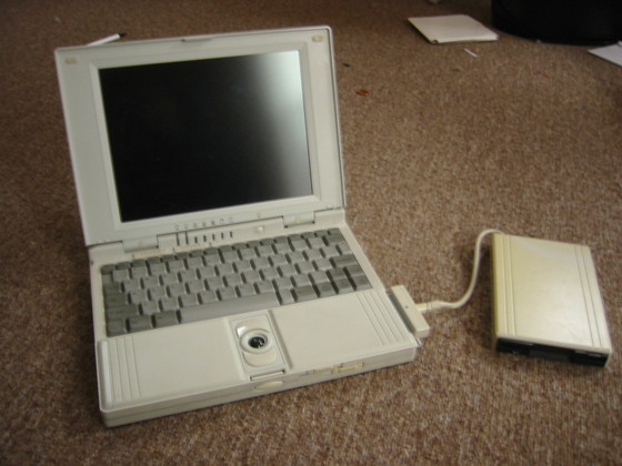
Tufts Connect Logo - Amazing slim laptop made my Mitac, 486- greyscale screen - ran Windows 3.1 like a champ. I shelled out for it (in the $800-1200 range) because I needed to take down diagrams in class- ASCII art on the Tandy wasn't always cutting it. With its trakball I doodled the logo they adapted for the Tufts dorm wiring project. After college I gave it to my mom but stupidly slapped Windows 95 on it, making it well-nigh useless.
- Gateway 2000 Handbook, ~1996-2000
- I didn't use this much, but for $50 I bought this adorable DOS machine off of Paul - it's kind of the form factor I had wished the Tandy had had. Never thoguht of a use for it though- even though it had a harddrive, I didn't have a way of getting stuff off and on it except maybe a serial cable.
- "Eggdevil", ~2004-2005
- A great little iBook I got an ebay. It kind of taught me that Mac didn't really work for me, alas. I gave it to Peterman when he helped me get the house ready for sale. The name comes from its egg-color and a devil BSD sticker he put on it. I think I got it back from him at some point, but then it got soda spilled in it.
- "Sliver",~2004-...
- I had have this Averatec laptop for like 6 years at least - nice moderate size. The power adapter on it got too wonky, despite my Uncle Bill taking a soldering iron to it... pretty good for DVDs in bed.
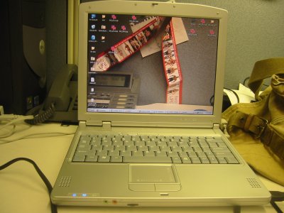
- "Frank",~2006-...
- Ugh, this was meant to be a straight on replacement for Eggdevil but I cheaped it on Ebay, and got this stinky-ish Franenstein machine (the lid seems to be of a different material than the bottom). I keep getting Macs 'cause I want to get into Garageband music making software but never get around to it. I think this guy doesn't have enough memory to be actually useful, so it sits on a shelf.
- Fujitsu Lifebook (x2), 2006-, 2009-
- I can't say enough good things about this laptop! Touch screen, netbook-size before "netbook" was a concept, durable... been with me to Japan and Portugal. I actually have two of these now, I bought a spare when I realize I could get a refurbished backup for $250 on Ebay. (A Newegg receipt makes me think the original cost me $1324 in 2006)
- OLPC laptop, 2007-...
- More of a toy, at least the way I use it, a One Laptop Per Child laptop I bought for the heck (and charity of it)
- "24", 2008-2009
- Bought a kind of cheap but big Acer laptop as an experiment (I think this was just before laptop prices started getting dragged down.) "24" is named after the Jeff Gordon sticker I had JZ get for me at NASCAR. Currently on loan, not holding up all that well.
- "Boilermaker", 2009-2010
- A heavy duty Macbook Pro I bought off of JZ... served me well by running WinXP under VMware as a developer machine. Currently on long term loan to a cousin. Named after a redneck car detail I got at the Topsfield fair for it.
- "Yoooouk!", 2008-2012(?)
- Oh boy. This is one of those HP touch ones that I had, and kind of have, high hopes for, but it's never felt 100% reliable and robust- had a bit of virus issue, the power plug seems a bit wonky like it was for "Sliver"... named for a "Yoooouk!" bumper sticker it wears that I got at a Red Sox game.
- "Brute", 2010-2013ish
- My new purchase, the Toshiba P505, a 18.4 behemoth of a machine, meant to let my "main machine" be a laptop, and make living at Amber's make more sense - so it could mark the end of the "Monk" era
- "The Axehead", 2010-2013
- My first at home switch to the Mac side, that weird 11" Macbook Air form factor... diminutive but great and portable, not quite enough HD/SSD space.
- IBM Touch Thinkpad, 2011-2012ish
- Got this for cheap at Micro Center, and for a while put it with a trackball as a dedicated Centipede MAME machine for my girlfriend
- "My Macbook Air", 2013-2020
- My work machine that I bought off them when I left the company. Still going pretty strong.
- "The MonkBook Air", 2020-2021
- Apple did a decent update to their venerable classic. This one saw me through the main year of COVID, easier to swap workspaces with my work Macbook Pros (see this entry for some reveling in stickers as I got my new MacBook Air...)
- SmackBook Pro, 2021-
- Time to get back to a big screen (not quite as grand as Brute was but still) and the new chip... a little calmer with the stickers.
Handhelds I Have Known
- TI flat thing, 1995-1997
- Man, I wish I could find some record of this! It was a cool, flat PDA I bought off someone at Tufts - rubberized grey and maroon, it had holes so it could be placed in a 3 ring binder. I first started jotting down quotes in this thing, but I couldn't connect it to anything. (UPDATE: It was the Texas Instruments PS-9500 TimeRunner )
- Palm Pro,1997-1999

the decorated IIIc - Its hard to explain how cool this was. When I first heard about graffiti, and humans having to learn a new way to write, I was skeptical, but man, having a powerful notebook/calendar/todo in my pocket was just astounding.
- Palm V,1999-2001
- Like the Pro, but slim and trim and awesome. I think this is when I started using "Landware GoType" keyboards which along with "PocketC" let me program on the go at a time when laptops seemed too extravagant a luxury to bring on vacations or cart around all the time.
- Rexx, 2001
- Heh, the laptop PCMCIA card-sized wonder was a bit too limited for recording notes and quotes, otherwise mighta been an ok PDA.
- Palm IIIc, 2001-2003
- Like the Pro but color... I kind of liked the minimalism of b+w but the text was so much more readable.
- Sony Clié SJ22, 2003-2006
- A nice little machine running PalmOS but with a double resolution screen. Nice soft flip case it came with.
- PocketPC phone, 2006-2007
- Oh dear. What a piece of crap this was. The slide out keyboard was nice but the OS was junk, despite kind of almost delivering on the promise of "an app where I can both doodle and write text" - in other words, why I bought a trackball laptop in 1995. It didn't just "butt-dial", it "sitting on the shelf by itself" dialed.
- Palm Z22, 2007
- I had forgotten about how much I loved this last gasp of Palm PDAs - it was so comfortable to hold, and cheap and cheerful. It deserved a better fate than to be drowned while kayaking.
- iPhone, 2007-2008
- I didn't mean to be an early adopter of this, but I was, and haven't regretted it. Even when it didn't have things I took for granted on the Palm, like "add programs" and "copy and paste", from its home screen on down this felt like the Palm, plus music, plus a great browser.
- iPhone 3G, 2008-2010
- What can I say - I needed more than 8 Gb for the music I wanted with me.
- iPhone ??? 2010-from here on in?
- I'm saying this has now reach the commodity stage. Great phone, a replacement for the Power Shot camera I started toting in 2001 or so, smooth transfer from one homescreen to another... no longer worth keeping track of
Is driving a car out of where it's stuck in the slush and slow Taoist? You have to follow the natural path of where the car wants to go...
Everyone who had a talent for it lived happily ever after
Rex is going to the vets to get snipped today. I feel a little bad but I guess it's just part of the deal cats and humans made on the species level.
MA FOLKS- don't vote for Republican filibuster today... we don't need a tyranny of the minority party!
Did you know that the Germans call duct tape "Panzertape"? Germans have cooler names for everything.
Really thinking I should have paid more attention to Processing.js; having access to all javascript in a browser-based sketch is great.
How are you all enjoying your new lives as biological robots? If the process went smoothly you should not have felt a thing.
A related anecdote... at work I was charged with coming up with a rough screen layout for an editing page with collapsible sections. I came up with something as follows:
Now technically we haven't gotten feedback for the new look but I suspect they'll love it. The changes are small, rounded corners, a softer color, and making the whole section colored. But it really points out how engineer-y my old thinking was; I had a mental block that said headers are headers, and content (in this case the checkboxes) is content, and never the twain shall meet. But now I can see the elegance of this approach, of treating each chunk as a collapsible block rather than as a series of sections with "appropriate headers". (My design re-used an old trick of mine, of using slashes and the letter "v" in a sans-serif font as arrows, rather than a graphic, but I don't think that's the big deal.)
So, what else makes a professional site? What are the clues, subtle or obvious, that speak "corporate"?
So looking at sites like Ford.com IBM.com, or my friend Tammy's atomicpink (she does design work for hire) and musing they look different than my look, I think it's some of the following:
- Nuances that move beyond just colored blocks: gradients, pinstripes, rounded edges. A lot of these are actually pains to pull off! And it probably does take some legitimate skill to do well.
- Use of stock photography... people just sittin' around, looking like they're lives are somehow better with your product
- There are certain layouts that are becoming defacto standards... all 3 of these sites use layouts based on a TV or billboard, with everything appearing above the fold. And no-one seems to use "flow layout", in general fixed columns are considered a better idea.
Heh, Celtics parade today. Wasn't there some highschool rule about avoiding wearing green on a Thursday? Oh well!
The meme of calling "synchronize with repository" (prelude to "checking in" code) "stink-ronize with suppository" is spreading at my office
|
| Hello, Sexy |
In general GPSes feel like they've benefit from competition in general, and give the sense that they've really been listening to consumer complaints and suggestions... my new Garmin nüvi 260 (three cheers for umlauts!) shows 4 years of improvements in the following ways:
- USA and Canada came preloaded... with the 2610 I had to load software and synch, using this crappy Windowd 3.1-feeling program to parsimoniously select the areas I wanted information on (even with a memory card I was only getting coverage of some of the USA.)
- The thing has a battery so a momentary loss of power doesn't cause it to drop everything
- The touch screen is more responsive and in general the typing UI is improved, it guides you through entering addresses and it stops having you type once it can only give you a few options.
- The view is 3D and like I noted on my mom's at first I thought this was a gimmick but it actually plays a nice, subtle role in emphasizing the most relevant streets. (Still need to figure out, if I zoom out enough so it switches to 2D, is there any way to get it to say "North is always up"... I hate the view with the Atlantic on the
rightleft. (duh, thanks LAN3)) - I haven't received proof of this with mine yet but I've seen how newer models do a much better job of picking up on poor satellite signals.
- My old one talked to me, but this one even reads street names! This seemed frightfully impressive until I remembered my Commodore 64 was doing the same thing in 1982. Only the US Female voice (and not the UK accent, which is my mom's preference for her Tom Tom) does this trick, and the end result in both sound and form is much like the psychotic computer GlaDOS from the videogame Portal.
- Calculator! World Clock! Currency Convertor! (Can you hear the scoffing?)
- It's tiny and light... and about a third the price of my old beloved brick.
Mostly, though, they seem to be working to keep the screen uncluttered, so there only readouts on the map are "ETA" and "distance 'til turn". The 2610 had "current time", "time 'til turn" and most importantly "current speed"... I got spoiled by having a digital read out of speed handy, I still think digitally and reading from analog (on a speedometer, or even when looking at a clock) takes a mental cycles to convert.
(heh, just to throw some cold water on this, there are some rumors that the next iPhone will have real GPS... assuming that has the same real time highway traffic data that I think their Google maps already has, that might really be something.)
Anyway, I still think anyone who ever drives anyplace they don't know intimately should get one of these. I've found this cheap at thrice the price... it is to driving what cellphones are to making plans, just bringing up a ton of flexibility and security.
young black guy working at dunkin has a ROXBURY hand tattoo--guess the gangsta aspect weirds me out but hey its my neighborhood now.
all right! t worker says I can transfer my pass to my tap and go card at downtown crossing, no problem.
living and working in Boston proper has its advantages. the number of gorgeous gals in little nothings of sundresses... yow
So it's with a heavy heart that I'm dropping "catchall"s for my domains. For over a decade, I've been happy to be able to cavalierly say "anything @ kisrael.com gets to me, so use whatever you like". Dylan is the only one I know who tried playing with that, but in practice it was harder to explain than just giving a normal email address, so I gave it up.
For a long time, I've weathered a storm of spam, since if they tried a "dictionary" style attack, sending to host of random usernames at my domain hoping to get a match, they all went to the same place. More troublesome are those moral-less, scuzzball, vile, scabrous, cowardly greedmonkeys who make their Spam look like it came from my domain, since then I would also get a host of bounces, and even the occasional plaintive handcrafted "please don't send spam here" message. (The scary part of this change is knowing that this will still go on, I just won't see it.)
The problem with this is the number of email aliases I've used. For a while I thought of trying to track spam by using a special address for every site, like if I posted to "msn.com" (not that I would) I would use the address "msn.com@alienbill.com". I never extracted much useful information from doing this (except that newyorkerforum seems to have been harvested by the spammers pretty badly) and now it means there might be some accounts I won't hear from again. (The other problem was talking to people on the phone, when I tried to tell someone from the company "Foobar" that my email address was "Foobar.com at alienbill.com", it would sound like I was confused about how email works.)
So, starting fairly soon, these are the only email usernames that will work for me:
kirk
k
KirkIsrael
kisrael
kirkjerk
kli
kirkles

web

loveblender.com
myspace.com
evite.com
netflix.com
paypal.com
wheresgeorge.com
phpwebhosting.com
Le Sigh. I hate Spammers so very much.
Game History of the Moment
Making the rounds is some insider information about the planned Sequels to the Hitchhiker's Guide text adventure. There are some objections to the publication of private, in-company email but it's still fascinating to read, and the site includes a semi-playable prototype of the game.
One quick gripe: I can forgive the current version of the iPhone software not supporting receiving and displaying MMS (multimedia messages) but ATT giving me a code I have to type in a web browser. I can even forgive, somehow, the link not being clickable in SMS and opening up in Safari. What I can't forgive, and find to be yet another misdemeanor against humanity, is generating a "pickup code" with characters and a font that's ambiguous. Upper case 'I'? Lower case 'L'? I can't tell, and I wasn't able to pick up my damn message. Do it all caps, or all numbers, or something, but think, people!
Video of the Moment
--Forgot where I saw this... brilliant, though.
I've come up with a few justifications for it.
- First and foremost: my phone and Palm died at once. And then a schedule phone conference gets canceled, freeing my schedule for the evening. And then the Apple store at the Galleria had it in stock. That might be a compound message from the cosmos.
- Sprint ticked me the hell off. I go to the store seeing if I could get a cheap replacement phone to tied me over. The cheapest they carry runs almost $200. Then I decide to revive this old phone I had at home (the PocketPC I need to ebay, I decide to risk my pants calling people again...) The first guy says that I need another available phone for activation, OR I have to dig out the battery and get some numbers. So I hang up, do that, call again, and the lady I then talk to says, no, I still another phone around, can't help me.
- I haven't found a satisfactory replacement from the great but ancient Palm UI... I tried the Rexx back in the day, and most recently the PocketPC, but nobody gets it right. To be fair, the iPhone isn't an acceptable PDA either, but I have hopes that it's so connected, web-wise, that I can put together my own online apps to do what I need.
- I'm not happy with my living room laptop, this monstrously slow frankenMac I got on ebay. The iPhone might do yeoman's service in that role. Also, it has google maps built-in, and it might be a good supplement to the GPS aging in my car, even if it doesn't know where I am. It could also replace my iPod Nano... jury is still out on that.
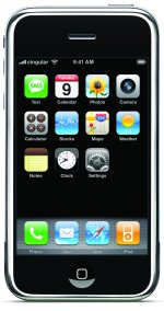 I was thinking about my various gadgets. The iPod Nano is just amazing, it gives me a small tangible thrill, it's so compact and elegant. And that humble Palm Z22 was doing a similar thing, with its lovely curved feel, and super-familiar interface. That Fujitsu lifebook, about as small as a laptop can be and still have a usable traditional keyboard gives me a good buzz.
My other gadgets, not so much. My Canon Elph is compact and takes great pictures, but it's not a delight. Similarly, my waterlogged Katana was never better than decent for me... plus it seemed to need its battery recharged way too frequently. I'm not so thrilled with the iPhone form factor, but it's still pretty slick.
Design wise... well, it's ok. I think glossy black and metal is a bit over-80s, but at least it's not the toilet white that was the old iPod hallmark. Looks a bit like a cigarette case from the back, actually.
Exchange of the Moment
"So are you going to play some Pac-Man CE?"
"Well I thought if I came over here, I should at least treat you to some two players gaming..."
"No, it's fine, I know how much that Pac Man game resonates for you."
"You're like my dealer! I better watch out or you're going to start charging."
"Yeah, that was my plan with the video games, 'first 9 years are free'."
Article of the Moment
I talked to a pretty wealthy lawyer in Cambridge, and he won’t go to Starbucks," says Simon. "For him, it’s an expression of his relationship to New England, but also to working people. Like he’s more populist through that.I know dunkies is definitely not as good karma as any mom-n-pop place (And I do go to Gail's on Medford St whenever I get the chance) but still.
Alright, I'm a little cynical. But I still think my Palm Z22 has about the best PDA UI out there, so much better designed around the constraints of working with a small screen than the Microsoft Outlook derived crap, or some of the cellphones that don't even pretend to make an effort at usability.
For a long time I've been amusing myself writing things in PocketC, a little computer language that lets you write, compile, and run things on the Palm. Only recently though did I start to notice there's also a Windows-y desktop version that lets you take the same code and make standalone Palm apps, which is a much cooler way to be. So here are two:
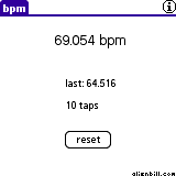
| bpm -- this is one of the few truly practical Palm programs I've made, despite (or because of) its bare appearance. If you just start tapping in the rhythm of a song or your pulse, it will give you the beats per minute after just a few taps. |
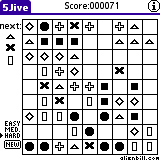
| 5Jive -- I wrote the core of this years ago, on vacation in Florida, based on a Windows game I saw there. Click on a shape, and then to some square it can move to, and when you get five or more in a row they disappear. |
|
I like the winding paths my unoptimized algorithm for 5jive ends up with... I tweaked the timing so it takes about the same amount of time no matter how many steps the shape has to take. Also I'm pleased with the tiny "alienbill.com" I got to fit in a 39x4 grid as a signature.
Links of the Moment
Two neat things on Slate today: 31 photos that changed the world and this link on some UK people enjoying playing with sins against the English language.
Too make up for the terribly dull and self-indulgent entry below, here's a lovely and addictive flash game: Boomshine... kind of a cross between Missile Command and Maxwell's Demon. The urging on you do of your little boomshine circles to just hold one one...second.........LONGER is amazing.
Ramble of the Moment

|
| I bought the red iPod, which gave a token amount to fighting AIDS in Africa. Also, this image is about half again as big as the real thing. |
(Admittedly, my judgement is biased towards stuff that's good to do geekwork to, so energetic music tends to have an advantage over the slower stuff, and long jazzy or classical bits have very little chance.)
So I decided to grant myself one final birth day indulgence, or reward for sorting through all this, and bought an iPod. I had an iPod a long while back, but didn't really have a spot for it, the car radio adapter was more trouble than it was worth. But now that I've started walking to and from the T station and my work PC doesn't have a reliable sound setup, this one should be more useful.
It's kind of weird that the 8-gig Nano costs the same as a 30-gig iPod video, but still I went for the former. Besides better battery life, and not having internal moving parts, its petite minimalism just resonates for me.
And for your reading pleasure, and since I was on kind of a self-indulgence roll, I thought I'd blow a day on kisrael discussing the 29 bestest songs on my iPod.
Music of Every Damn Moment
The first three I identified as the Best. Songs. Ever. a long while back. They are Deee-Lite's Groove Is In The Heart (which I am morally compelled to dance to every time I hear it, even if just a little), Buildings And Bridges by Ani DiFranco, which is the most beautiful blend of dimestore profundity and musical grace I've ever heard, and It's Your Thing by the The Isley Brothers, the bass and piano that never fails to grab me by the cajones. (There's a bit more R+B in the Top 29: James Brown's I Feel Good and Soul Man by Sam & Dave.)
I've always loved Fever by Peggy Lee, and Shirley Bassey has a similar vamp effect in the Propellerheads' History Repeating.
Lately I've been getting into mashups, Tripper Trouble is dj BC mixing up the Beatles and the Beastie Boys, Groove's a Bitch by dsico is Groove is in the Heart plus She's a Bitch plus Just 1 Kiss, My Other Car Is A Beatle by Jay-R is an even bigger swath of artists. And before there was mashups there were covers and remixes, like Shake Your Thang, which really is how Salt-N-Pepa introduced me to It's Your Thing, and more recently JXL's A Little Less Conversation revived a sleeper Elvis work. Also two by Tom Jones et al.: Burning Down The House and Sexbomb.
Mystery Dance by Elvis Costello is the only song to appear in the Top 29 twice, it's short enough that both the electric and acoustic versions seem worthwhile.
Cake's The Distance always holds a special place in my heart as being my big solo in Tufts' sQ. Then there's a string of modern stuff... Smash Mouth's Diggin' Your Scene and the overplayed but great AllStar, t.A.T.u.'s All The Things She Said, the nostalgic drumline of Gwen Stefani's Hollaback Girl, and the cool retro-western-gogo of Legend Of A Cowgirl by a Imani Coppola
Slowing things down, Holly Cole's cover I've Just Seen A Face is just lovely, and I find Dar Williams' As Cool As I Am, Paul Simon's Tenderness, and Willy Mason's Oxygen can all move me to tears when I'm on the hunt for that kind of catharsis.
Finally, some oddballs: Johnny Cash's Riders In The Sky is just THE cowboy song for me, Maynard Ferguson's Chameleon is the only instrumental to make it here, and Madonna's Hanky Panky (Bare Bottom 12" Mix), with its giant percussion and naughty spanky talk is the best thing to have spun off from the movie Dicky Tracy.
I might be willing to make a mix cd or mp3 set if anyone is interested.
- One grey lining to the silver cloud of the Wii's innovative controller schemes is that they've ditched the traditional "start" button, and while every game seems to respect the "home" button that takes you to a system menu and offers to totally reset the game (almost like power-cycling), there doesn't seem to be a single convention for an "in game pause menu" that might offer to, say, end the current match and return to the previous menu. The Plus button seems to be a non-universal standard for it, but games like "Super Monkey Ball" ignored it. Or seemed to... through trial and much error I finally figured out it's press and hold of the Plus button. That's irritating! The button serves no other use during the game, and it's not in place where it's likely to be pressed accidentally. So why do that? What possible benefit is there in making people think "this button does nothing"? Is the needed prolonged hold a way of expressing the sincerity of our desire to stop the game?
- My car radio's tuning feature. By default, pressing up or down adjusts the tuning .2 degrees on FM or whatever. Like most modern cars, it has a "seek" function, which kicks in after a second or two after pressing and holding the button. Now, given what a huge percentage of the time is spent driving near home, and at any given moment people likely have a big selection of strong radio signals to choose from (rather than having to fiddle and tuning in a station that's almost out of range), how smart is it to have the default be "tweak this tuning" rather than "find me another damn station"? And when you're trying to "channel surf" radio stations, the extra second of delay is infuriating. You listen, judge the content in like a quarter to half a second, go to move on, and listen to whatever crap you just rejected for another second or so, 'til the thing beeps and moves on to the next station...
- Ksenia's grandfather's radio... he asked me to set the clock for it. Now, clock-setting is a whole 'nother ball of bad-UI wax, but having to press. And hold. And hold the button labeled "Clock/Sleep/Timer" was just not something Ksenia's grandfather was going to stumble on by himself.
Dumb UI designers: making your life a little worse in a thousand little ways.
We go straight from the gut, right sir? That's where the truth lies, right down here in the gut. Do you know you have more nerve endings in your gut than you have in your head? You can look it up. I know some of you are going to say I did look it up, and that's not true. That's 'cause you looked it up in a book. Next time look it up in your gut. I did. My gut tells me that's how our nervous system works.
I believe the government that governs best is the government that governs least. And by these standards, we have set up a fabulous government in Iraq.
Because really, what incentive do these people have to answer your questions, after all? I mean, nothing satisfies you. Everybody asks for personnel changes. So the White House has personnel changes. Then you write they're just rearranging the deck chairs on the Titanic. First of all, that is a terrible metaphor. This administration is not sinking. This administration is soaring. If anything, they are rearranging the deck chairs on the Hindenburg.BoingBoing has a more canonical set of related links. The video even has its own fan site, Thank You Stephen Colbert.
The Daily Show and The Colbert Report (pronounced with a soft T for both words) are... amazing. Maybe the most important thing basic cable has ever done; sharp, cutting satire that's also damn funny.
Kirktrivia of the Moment
More mundane things in my life for the avid consumption of my readership: I got a new desktop system, one continuing my obsession with compact consumer goods. This computer will be named Monk, sixth of that name. Here's the new hotness next to the old and busted...
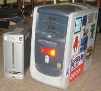
I've disappointed some of my Mac-friends by shunning the Mac Mini, even though it's smaller and could conceivably dual-boot to XP. My gut (heh) just told me to keep it simple, and this slab actually appeals to me more than the little box of the Mini, which seems like it would almost get lost on my desk. Since I'm pretty laptopped up, I mostly turn to the desktop when I need to hunker down and focus, and right now I still only do that well on Windows. Plus the new HP slimline also has some nifty features, like a built-in multicard reader and Lightscribe laser-etching for CDs and DVD it burns, if I'm willing to shell out a bit more for the media.
I ended up stickering Monk 5 quite a bit...

|

|
Now to get to taking away all the Fisher-Price crap UI and loaded up "special" offers and get to work...
Before settling on bringing it in for repair, or rather replacement, I took a look at the handset offerings from Verizon, T-Mobile, and Sprint.
Man, cellphone design in this country ain't a vast wasteland, but it's no Garden of Eden either.
No one makes "nice and compact" a priority these days. Even the phones out to make themselves super-thin end up being tall and wide. And then everyphone has to stuff itself so full of gizmos that it ends up fat and bulky...especially with the clamshell design, which is the only type I'll go for. (I'm tempted to go back to my 2001 Samsung but I guess it doesn't do text messaging. But now I appreciate its design; compact screen, and a flip design with a thin cover that merely protects the keypad rather than having the keys embedded in it.)
T-Mobile had the Motorola PEBL... as you can see by the "artsy" timedisplay it seems like they're giving a lot more thought to the aesthetics of it... the appeal for me was the nice rubberized texture of the outer shell. But even with that I'd worry about the strength of the cute little special hinge it has.
But Sprint/Nextel swapped my phone for free, and I couldn't really justify the expense of a new phone...it's not a bad model despite my gripes with it. (Pity that Samsung/Palm hybrid was such crap software-wise.) I had to manually move numbers over, and I lost the video of the Euclid municipal Fireworks that was my "video wallpaper". Oh well.
Oh, and I have one more new grip about the current phone: I can assign custom ringers to individuals in my phonebook, and there's a feature for a distinct ringer "with caller id" vs "no caller id", but no distinct setting for "in phonebook" vs "not in phonebook", which would actually be useful to me, instead I'd have to set the ringer for each phonebook entry seperately.
Am I that much of a UI prima donna, and/or assuming too much that people work the way I do, or are the people who make these things just not all that bright?
Sports Quote of the Moment
Baseball is the only major sport that appears backwards in a mirror.
Scariness of the Moment
Dunkin' Donuts is spreading its wings. The chain is expanding nationwide and plans to triple in size within the next 10 years.Ugh, maybe Candi is right, this is like a mold. I like the vibe relative to Starbucks, but still... they're frickin' everywhere, popping up in stripmalls and inside regular malls and other places that still seem weird to me.
Gotta give them props for They Might Be Giants tunage though.
You know, it used to seem really cool to be building houses with Cat5 cables running in the walls, but now that wifi is cheap and easy, it doesn't seems that important any more.
For that matter, phone jacks don't mean much to be any more. I don't even know where (or if, though I assume) they are present in my current apartment.
Tricks of the Moment
cute little body hacks from Men's Health, though I'm not sure how much stock I'd put in some of them...
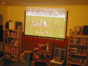 It's probably hard to judge from that photo, but the image is pretty dang big...much bigger than any flat panel or regular TV I could hope to afford, and unlike the TV it replaced, the projector doesn't outweigh me, all for...I dunno, $1200 maybe? Plus the too many cables I let Evil Bastard (who was a great help in the whole shopping and installation process) talk me into.
Also, I decided to buy a stereo receiver rather than juy rigging some frankenstereo. This is what my A/V stack of receiver, DVD, VCR (mostly need because I don't have a cable box) and projector looks like, along side my big comfy chair:
 You know, I have mixed feelings about that stereo receiver. It's fancy enough that the volume control is "virtual"...turning the physical knob makes the volume readout change, but it's annoying because you can't just give it a quick twist to turn it all the way down, and in general you have to turn it too much to affect major changes. Also, it gives you the "true" volume reading in dB, which is extra annoying, since that's a negative number that unintuitively looks like it gets smaller as the volume increases. Way too much audiophile wankery for my taste, or for the recycled speakers I'm using with it.
So there are some drawbacks, but if you have a long enough room (you need maybe 12-14 feet from the projector to the screen) that you can make dark you can get a great big picture for relatively cheap. FoSO mentioned that someone they know conducted some tests, and Tyvek (a building material) reflects a big percentage of the light, so you can get a decent picture by stretching Tyvek over a wooden frame. I might try that if I continue to be annoyed by the current screen not making good use of the available wallspace.
So I guess those are three not-too-too expensive electronic luxuries (under $1K for each, if you're frugal) I'd recommend to anyone: a video projector, an car GPS navigation system, and a small laptop for the living room (and a now-dirt-cheap wireless network to run it on.) These are along the neccesities of electronic life, all of which can be had for like $100 each: a palm pilot, a digital camera, and a cellphone.
Product Imitates Imagination of the Moment
Weird...just the other day I was thinking about chastity belts (and how much they might chafe) when I had the idea that the whole "WWJD"/abstinence-only teen movement should make up special chastity panties with a symbolic lock and key imprinted on them. I even came up with the perfect name for them: "Undies for Fundies". It turns out the product basically exists, available at Target at Blue Q Chastity Underwear. (I guess there's a small chance I heard about these earlier and forgot about 'em, but as far as I remember I was really just mentally riffing on old school chastity belts.)
And I don't even need a laptop for work...it's been nice a few times when I wanted to "work at home", and when I want to have a document at a meeting without printing it out, but overall, I have one because when I asked for a flatpanel in 2002 those screens were considered luxuries...so they gave me a much more expensive laptop instead, go figure.
So the laptop was sluggish but usable. Then they added some Symantec virus scanning, and now the thing is just silly. For some reason the system is setup to do a full deep scan daily. When the scan is going full out, the harddrive is whirring constantly and sometimes I can watch a newly visible application's window refresh, drawing in the window line...by line....by line....by line. The system runs like molasses. In January. On Pluto. During a coldsnap. My only recourse is to spend about 20 minutes or so shutting it down and then restarting...I can't kill the scan process directly...it's protected, 'cause killing it is exactly what you'd expect a virus to do, innit?
So there is of course a tremendous irony in a virus scan procedure doing more damage to my productivity than any virus has ever done. It's the computer equivalent of a neurotic who can't stop washing his hands...I get this image of the scan program running around frantically, hunting through every other nook, every cranny, and it would do this same deep frenetic searching every day if I let it.
Help is on the way, however. I'm getting a kick-butt new desktop PC either this week or next (and now flatpanels are standard here, not a luxury (in fact a lot of people use 2) so I'll be getting one of those too.) Even though the rate of relative PC speed increase has dropped a lot lately, it's a little odd thinking that this will probably be the fastest most powerful computer I've ever touched or used directly. (Or not....I can't remember if I've messed with much "big metal" servers that would blow even the most modern typical desktop away.) So that'll be nice. Maybe they'll let me keep my old laptop for a while, and I can let it do nothing but run its virus scan day in, day out, whirring happily and neurotically to itself and generally keeping busy.
Gripe of the Moment
Grrr...when did Apple start make QuickTime download == iTunes download?
Windows Annoyance Rant of the Moment
I wrote this to send into the site ThisIsBroken.com:
This might be more of a gripe, or just a reluctance to shift to a new mental model for search, but the way recent versions of Windows conduct file searches in the sidebar of the current explorer window seems like a huge step backwards from the old way of a seperate finding app...
- You lose your place. Often, I'm still interested in keeping the current explorer view open when I hit Ctrl-F to conduct a search, but now my whole window becomes dedicated to this one search task.
- Often in NT2K it takes a few seconds for the "Look in" field to be automatically field in with the location of the current Folder. Type in a quick search term, hit return, you get a message "A valid folder name must be entered"
- The only way to know if you're looking at a "real folder" or search results is to look at the window caption. And even when the caption indicates "Search Results", it gives you no hint of what you were searching for. (Admittedly, a detailed description could get wordy, but still, having 3 windows that say "Search Results" in the task bar isn't that useful in refinding a specific window.)
- To get your normal explorer view again you have to hit an IE like "back" button. This seems like a broken paradigm to me, that viewing a folder is one "task location", viewing search results is another "task location". To my mental model, an explorer view represents a "noun", and a search is more of a "verb", results and all. It's not like search results are really making up a "virtual folder".
- When you hit "back" to return to your folder view, the sidebar stays up. But the "Look in" field doesn't get filled in with the new folder location unless you close the sidebar and reopen it. Conversely, if you close the sidebar, your search results remain...it looks just like a regular folder though! Also, the "Look in " field changes, but the main search fields remain filled with the old data, which is useful but inconsistent.
- To start a search you either have to know the Ctrl-F mnemonic or use a graphical icon, there doesn't seem to be a regular menu option for it.
- If you accidentally hit "Up Folder" instead of "Back", you get taken to a folder view of the Desktop. Why isn't the "Folder Up" option greyed out while conducting a search? It's not like it's an easy way of backing up to the parent folder to redo the current search...that requires all the steps I outline in complaint 5...
- Don't get me started on XP's default "File Searching For Dummies" mode. Maybe it's good for novice users, and it can be turned off, but for exerienced users it's just a pain in the butt, and we become amazed that other people who seem otherwise to be pretty bright always use it...or even worse, with the goofy animated assistant.
Maybe they were looking for a way of letting someone repeat a carefully constructed search from a different location (hence the inconsistency in complaint 5) but it seems like a poor tradeoff to me.
This app is something I use on a daily basis, and not liking its forced browser model (probably some offshoot of that whole "oh but you can't seperate the browser from the OS!") is a constant low-level thorn in my side.
If anyone knows a way of getting back the old behavior when I hit ctrl-F, I'd love to hear about it. Even some registry setting that causes a Ctrl-F search to open up a new window rather than overtaking the current one would be a HUGE improvement.
So it is a subjective opinion, but I'd say: This Is Broken.
Already made the rounds, but when I finally came back to Troy in 15 Minutes, I realized it was really pretty funny, and stuck pretty close to the movie in some amusing ways.
In the for what it's worth department, "cousin" is one of those words that never looks like it is spelled quite correctly to me. I think my mental ear keeps hearing "cous-cous". Which is a totally wonderful name for a food, right up there with "fallafel".
AAAAAARRRRRRRGH of the Moment
So I reach over to pick up a sandal this morning and BIP! There goes m'back. Lower center back, I'm literally on the floor in pain. So awesome. This is going to be the most fun weekend packing and finishing getting ready for the movers on Monday EVER.
I blame Peterman. And myself for listening to him. "Oh, you can use these bins of mine for all these books. They have handles." They have handles but they're the SIZE OF FRICKIN'...well...I don't know what's a good comparision for that size, bigger than a breadbox, more to the point significantly bigger than a "booksize box". I was hauling those around last week, just the tiniest bit of friendly warning strain, and then this.
Of course I can't be too bitter, between helping me with some books and then our trip to six flags, he's not doing any kind of lifting either. Still, what a marroon.
Doggone it to little pieces.
Requiem for a Cellphone
In happier news, I finally got a new cellphone. (I also finally got off Sprint's "Screw You Five Ways From Sunday" plan and onto a much fairer plan...also by Sprint, the one their advertising with the elementary school teacher and the dodgeball and what not. Verizon's showroom was crowded, I never got to the top of the sales-help queue, and also their plans are a lot more expensive.) It so kicks my old one's butt...this picture here was taken by my new one, of my old one. I wouldn't have bothered with a cameraphone, but then they showed me one that takes little video clips...and I'm a sucker for anything that can take grainy little video clips. It also has all sort of nice sound and graphics options, seems to have pretty decent recepion, and has two color screens, the main one and then a little timekeeper one on the outside. (I even found out you can use the outer screen as a viewfinder when the cellphone is closed, though in that case the camera is pointed back at yourself.) Plus the screen make the menus much easier to use...
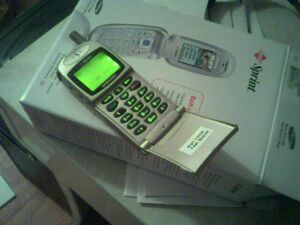 But, as is par for the course, I'll think nostalgically about my first cellphone. It was a cute little fella, unpretentious, and travelled easily in my pocket for the past 3 years. Kept me in touch with the world... I really have trouble remembering how difficult it was to modify plans on the fly without these things. Also, I'll miss how it came with a convenient snug cradle.
Both phones are by Samsung, and I really thing they have a great knack for these compact devices.
Incidentally, I got a pretty bad headache at the Verizon store...sometimes I wonder about all that EMF bouncing around especially, and this might be a little psychosomatic at this point, from cellular modems. They had a laptop set up there...and I remember when I was evaluating a clip-on one for the PalmPilot for work, I used to think I was getting headaches much more often...
I woke up with a bit of a tune ssticking in my head...took me a while to realize it was this little ditty from Hey, Hey 16K, kind of a tribute to the early 8-bit home computers, UK-centric though, so it's interesting to see what they had and we didn't...WARNING, catchy little tune. I kind of liked the knuckle cracking simulator by the same guy.
Quote of the Moment
You know, kids, Drew's head is just like a piñata. If you hit his head enough times when he's sleeping, candy comes out. Well, first blood, then candy. Keep hitting.
Introspection of the Moment
So I've been trying to use this time for some introspection, taking the experience of divorce to try and learn more about myself. Here's a thought that just crystallized: for me, roughly speaking, nothing is sacred. Which ties into me not having a sense of privacy, maybe it ties into not having made a big deal about my romance with Mo.
Lately I've been trying to figure out where this view came from, why my sense of "this is sacred, untouchable" is so much less formed than with some other people. Maybe it's the church I grew up in? The Salvation Army has a pretty terrific roll-up-your-sleeves approach to religion, very non-mystical. We don't take communion, don't baptize with water; you're expected to establish your personal, unmediated relationship with Jesus Christ and then get to work being a member of the local church community, taking part in the big metaphorical and literal war against sin. Relative to, say, the Catholics, there's a lot less mystery to it. And I always got to see behind the scenes anyway, as a child of the ministers, and then as a member of the band and active participant.
But there's so little sacred in my life...not even stuff like my divorce or the death of my dad is taboo for the occasional macabre joke. (Which he would likely would have appreciated, he had some similar inclinations to dark humor himself.) I try to be respectful of other people's "sacred spaces", with varying levels of success. I think my strongest sense of the sacred and spiritual comes out in this passage from Henry Miller's "Tropic of Capricorn": (pardoning the sexist language.)
There are no "facts"-- there is only the fact that man, every man everywhere in the world, is on his way to ordination. Some men take the long route and some take the short route. Every man is working out his own way and nobody can be of help except by being kind, generous, and patient.Kind, generous, and patient. That's what I aim for, but sometimes my own way to ordination is slow and painful itself.
Maybe I need to get better at setting up sacred spaces, at drawing certain boundaries, at following certain rituals. I dunno!
Geek Note of the Moment
This is the first kisrael entry from my new cute iBook. From my living room, no less...I went ahead and got my wireless mojo working again. And sitting on the couch and hitting the Internet is what this laptop is all about for the time being.
It's a little intimidating being such a newbie all over again. Mac definately is a bit different of a paradigm...more "app" based than window or even document based, I guess I'd say. I still need some time to form my final opinion. In the meanwhile, I think I will be more able to empathize with my mom and other non-techies I help out from time to time. (Or maybe I'll be worse..."look, I learned this in a day or two, why can't you??" Hmmmm.)
It has been a long time since I've had a new laptop. I mean a long time...I bought this one great Tandy 1100FD laptop in 1991 or 92...it had no hard drive, and an odd (but readable) gameboy like CGA screen, but with a very decent text processor hard-wired in, so I was up and running very quickly. I used it to take notes in class, which made me something of a freak back then, but hey...I had notes I could read afterwards. In 1995 I bought a cheapie "Mitac" laptop, 486, 16 shades of grey...ran Windows 3.1 ok, and I could use its little track ball to do diagrams (as well as school logos.) I used Mo's 1999 VAIO and her much more recent Dell, but that's about it.
Ok, this is a really boring entry. But...it is on my new laptop, and that has got to count for something, right? Right?
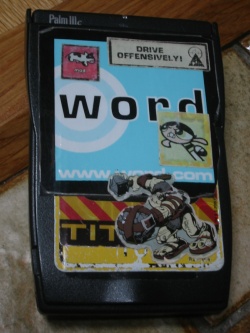 So I'm finally retiring the old Palm IIIc. Actually, it's Mo's old IIIc, she generously let me use the one she got when mine when on the fritz. I got the IIIc January 2001, though you can see be jonesing for something new
a few days before. Wow...when I got that IIIc, I was still at my dot bomb!
So I'm finally retiring the old Palm IIIc. Actually, it's Mo's old IIIc, she generously let me use the one she got when mine when on the fritz. I got the IIIc January 2001, though you can see be jonesing for something new
a few days before. Wow...when I got that IIIc, I was still at my dot bomb!Anyway, the IIIc was always a bit wider and longer than I liked, so I took to decorating its case with stickers, you can see the last rendition here on the left. I liked how the stickers piled up over the years.
UPDATE: Heheheheh. I carried this Palm with roughly that group of stickers for months, and only after having that picture posted for 10 hours do I notice the way the Small Soldiers Ogre's boulder turns the TITAN A.E. into "TIT". My inner 12-year-old must've been asleep!
Its replacement is a Sony Clié SJ22. I've kind of warmed up to it now that I see it's styling as a bit iBook-ish, but man, is this thing girly:
- The name: Clié? I mean, it sounds like woman's name or cosmetic already, and the e-with-an-accent just makes it all the more swishy.
- Actually, with its soft grey tones and overall styling, it kind of looks like something from the cosmetics counter.
- The flip lid is, I kid you not, just slightly fuzzy, almost like it was covered in something like velvet. Or something, I don't know much about material.
- The stylus is much less rugged-feeling than on other Palms. In fact its silvery-metal, with white plastic at both the writing point and the other end. It looks like a frickin' twirling baton!
I know it might be odd to write this much about a piece of hardware, but I've had a PalmOS device with me ever since fall of 1997, so it's an important accompanist to my brain...
Invention of the Moment
Call me gadget-happy, but I think I'd really like to get one of those high-tech toilets Wired is writing about.
Prank of the Moment
ZUG has fun with credit card receipt signatures. I liked the surrealness of some of them.
I haven't thought about ZUG in a long time. I love how it informs you that "You're reading ZUG, the world's only comedy site."
I've already written about how inanimate objects can take on new significance in the context of romance. (An idea wonderfully explored in Tom Robbin's "Still-life with Woodpecker") One of these tokens is on the verge of leaving my life and it's sad, in a goofy sort of way.
My family has had this Sony "Dream Machine" clock radio for years. It's a practical, almost feisty little cube. Throughout high school it dutifully sat in the bathroom, its turquoise LED showing the time to anyone who took the time to look, and tinnily playing the Cleveland Oldies station for me and the NPR station for my mom. (Since then, I've realized that my mom had much better taste in radio programming.)
 This service, however faithful, wouldn't be enough to earn this memorial
in the Blender of Love. Not until college did it the clockradio play a
role in my romantic life. College was where I first got the chance to
sleep with (in the non-biblical sense) the people I was in love with, and
the Sony Dream Machine was there to wake me and my beloved so that we
could face another day of classes. The fact that there is more than one
woman I woke up with during this time somehow strengthens my bond with
this little machine: it proved to be a more constant companion than any
romantic interest. In fact, you could say that I was fairly intimate with
that clockradio (in the non-biblical sense,) able to set its alarm in the
dark, able to turn off its alarm while still slumbering. I'll remember
some of those early morning tableaus for the rest of my life.
But now, it's time to move on. The clockradio is looking pretty grungy. Years ago the plug for its 9-volt backup battery broke- when the power goes, so does its sense of time. When you shake it, there's a very suspicious clunk and rattle. Still, I would probably be able to squeeze more years of service from it, but currently the bedroom has no room for a bedside table, so I had to get a new alarmclock, one with a giant readout that I can easily read from a distance, even without my glasses. I'll miss the little cube, however, and am grateful for the job it's done, and the role it has played in my romantic history.
So I've been going a little nuts going over my old posts. Here's the first one of mine I could find. (Actually, the searching mechanism seems a little buggy, you can see it by fiddling with the dates, so it's probably not my first first post.)
Ok. Time to prove my true navel-gazing geekdom. Here's a handy chart of all the accounts I used to post, and related info:
| account | dates | # | #/day |
|---|---|---|---|
| kisrael@pearl.tufts.edu | 28 Apr 1993 - 14 May 1993 |
9 | .56 |
| kisrael@jade.tufts.edu | 14 Sep 1993 - 05 Jun 1994 |
102 | .39 |
| kisrael@emerald.tufts.edu | 15 Jun 1994 - 27 Feb 1995 |
139 | .54 |
| kisrael@diamond.tufts.edu | 23 Mar 1995 - 25 May 1997 |
486 | .62 |
| kisrael@allegro.cs.tufts.edu* | 26 May 1997 - 28 Sep 1997 |
265 | 2.12 |
| kisrael@allegro.cs.tufts.edu | 28 Sep 1997 - 29 Jul 1999 |
1950 | 2.9 |
| kisrael@andante.cs.tufts.edu | 03 Aug 1999 - 12 Jul 2000 |
873 | 2.5 |
| kisrael@andante.eecs.tufts.edu | 15 Jul 2000 - 01 Sep 2001 |
962 | 2.33 |
| kirkspam@alienbill.com | 01 Sep 2001 - 11 Dec 2001 |
483 | 4.8 |
I'm a little alarmed that the average posts per day has doubled lately. It may be a spike, since it's a smaller than average sample, and I posted a lot right after September 11th...
Funny of the Moment
> Actually, I have heard rumors that Howard SternEvery once in a while I'm worried that I used to be funnier.
> and H Ross Perot are one and the same. (Have we
> ever seen them in the same room, huh? huh?)
No, that's not true: in fact I have them both in my room right now:
say Hello, Ross:
Hello! I'd l
That's enough Ross, thank you. Howard?
This is fucking ridicu
Thank you, Howard.Kirk "and the truth shall make you free" Israel
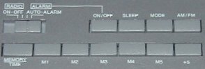
Strike Two: I could not figure out how to set the alarm. It's as if they worked to make the button labels as unhelpful as possible...not only that, but it's easier to set the time than the alarm. The rocker switch on the front is labeled both tune up/down and hours/minutes, so obviously it has something to do with it. But none of the other button labels said 'set' or 'alarm'. Now, hitting 'MODE' seemed promising, because on the front panel it started flashing 'SET ON'. Hitting the hour/minutes button did nothing though. This is when I had to download a PDF copy of the manual. It turns out to set the alarm you have to also hold MEMORY/TIME down. Now, since that button on the front does double duty for tuning and time setting, it makes sense that you have to hold down another button or the clock has to be in 'set mode'. But both? Why is that? A little experimenting reveals the answer'if you hold MEMORY/TIME down and press the front button when not in 'set mode', you change the time. Not the alarm, the time. That means it's about twice as easy to change the time than to change the alarm. Now, which one do you think people do more often?
My college roomie Brian used to add or subtract hours to the time setting of his alarm clock rather than change the alarm time itself. For years I assumed he did it because of a sense of surreal-ness it added to everything. Now I'm wondering if he had a clock as user hostile as mine.
Strike Three: If there's one thing an alarm clock should do, it's wake you up on time. This clock has a little icon on the front panel. When you hit the [ALARM] ON/OFF button, this icon goes on and off. One might assume that this means the alarm is on, or that the alarm is off, accordingly. No. Because, see, if that switch on the left is on [RADIO] OFF, your alarm clock will not wake you up for love nor money. It might display its little alarm icon, lulling you into a false sense of security, but next morning that radio will not play. The stupidity of this design overwhelms me. I can see the half-assed logic (wanting to separate turning the alarm off in the morning from just hitting snooze) but' jeez. Your clock shouldn't lie to you.
For the exact same manufacturing costs, I could've designed a better UI than this. Just making labels less misleading would be a start. (I still don't know what '+5' does.) Changing a few behaviors (making it easier to change the alarm than the time setting, not showing the alarm icon if the alarm is turned off because of the switch) would be even better. Changing a few more electronic readouts could actually make it intuitive!
Anyway.
I hate to sound like a curmudgeon about this thing, but it really is bad. I'll try to justify my rant with this next quote:
Quote of the Moment
If people were going to use computers all day, everyday, the design of such machines was not solely a technical problem-- it was also an aesthetic one. A lousy interface would mean a lousy life.
News of the Moment
Salon article: Judge rules no webcast of McVeigh's execution. Now I'm against the death penalty. But if you're going to go for it, you should really go for it. Don't try to pretend there's some kind of dignity here. Go full tilt for the bread and circuses. If the people demand revenge in cold blood, give it to them! In full color! And Dolby Stereo! On national tv! Really get that "deterence" message out there!
"Well, ya know, old Bush is a post turtle [...] When you're driving down a country road, and you come across a fence post with a turtle balanced on top, that's a post turtle. You know he didn't get there by himself, he doesn't belong there, he can't get anything done while he's up there, and you just want to help the poor thing down."
Quote of the Moment
When you reach the ripe old age of 27 like I have, and you have the choice between investing time and investing money, you realize you should never go for the time. You can always make more money...
 The other day I got a medium case of technolust for
my cow-orkers's Compaq iPaq PocketPC. It's a handheld PDA, much like the Palm V I already have. It has a much better screen than any of the Palms, 320*240 vs 160*160, which is 3 times the number of pixels in the same space. And it's color. My friend was showing me the map app it came with, zoom in and out, like an amazing electronic atlas, I'm not sure if the Palm has enough oomph to do that-- he's also laying out the bucks for a clip-on GPS for it... I've been longing for one of those never-get-lost-while-driving setups for a long while. Of course, it's not quite as slick or small as the Palm.
The trouble with the PocketPC isn't the hardware, of course... it's the way each program has a new interface. PocketPC feels like Windows 3.1 in interface, before the standards were settled, while Palm has some of the elegance of early Mac, circa 1988 or so.
It sounds kind of weird, but changing away from Palm would actually be a bit of a lifestyle change for me. For almost 4 years now, I've been keeping up the KHftCEA on a Palm, a commonplace book (quote journal) / dear diary collection. It's become part of what I am, part of the "extended me". But with this new kisrael.com 'blog, I've had to think about the two should relate, and what the point of the KHftCEA has been. In many ways this 'blog is better: it's updated daily, it's designed to be presentable to people, it can use images, it links to the outside world. And I can get to it to update it at home and at work. Still, having a copy on me always is important, so that's why I'm thinking about changing my PDA.
