2006.11.23

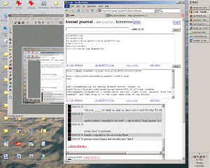
I started doing this with my work laptop. Like a lot of new laptops, its screen is in "widescreen" format. It turns out this screen is nearly as wide as my desktop's, but about 3/4 the height. Since my documents are longer than they are wide, and I usually don't do much side-by-side windowing, this makes things feel a bit cramped... making the taskbar a sidebar is a big improvement. Other benefits:
- You can fit a lot more buttons there (yes, I've been teased for how many windows I tend to have open at once)
- "Group Similar Taskbar Buttons" tends to (usefully) sort rather than (annoyingly, IMO) combine multiple windows into one button
- If you do want to see the full title of your windows, just drag and make the bar wider...an effect you can't easily duplicate with the taskbar in its usual position, since Windows tends to limit the width of each button even if you give the bar lots of real estate.
The biggest downside, then, is the Start button... the annoying thing is that the little arrows indicating a lurking submenu are always pointing to the right, even when its obvious the submenu is going to have to pop up on the left...
