
2009.08.21
|
I've been thinking about the Logo design of the some of the toy lines of my youth. (The best image of most of these online seemed to have black backgrounds, so I'm experimenting with colors here.)
Arguably, the most notable was Transformers, Autobots vs Decepticons: 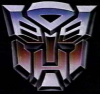

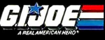
The toys all sported the badges of their particular faction, and for a while it was good, but then they added these "rub stickers", kind of heat sensitive, that were more or less opaque 'til touched. That would have been ok I guess (if a little non-sensical story-wise) but unlike normal stickers, the rub stickers were in grey boxes which were an aesthetic mess on otherwise cool robot toys. (I guess Hasbro wanted something for its toys that the knock-offs couldn't have.) Arguably the very coolest logo of the 80s was for the G.I Joe bad guys, Cobra: 
(and then of course there was the time they teamed up with the Transformers bad guys:) 
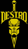
I've seen this one floating around, I don't know if it is new for the movie or what: 
I'd argue that even back in the day this kind logo work set G.I.Joe and Transformers apart from some of the other toy lines. Like, compare some of this cool iconic stuff to johny-come-lately MASK: 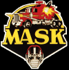
Hasbro (or whoever) kept up the canonical mask idea for later toylines, like in "Beast Wars" where it was Maximals vs Predacons: 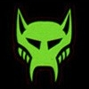

|
http://daringfireball.net/2009/08/the_android_opportunity - Can Android be saved? I worry the AppStore might make iPhone's early lead even tougher to overcome because people come to rely on specific apps.