 tag/gadget
2010.11.21
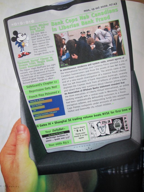
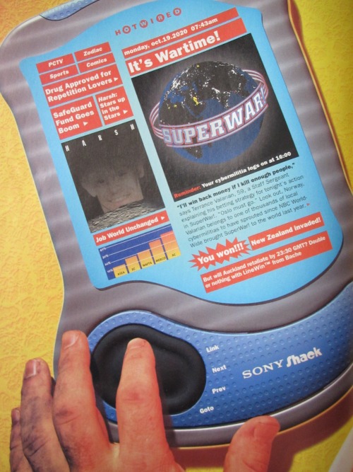
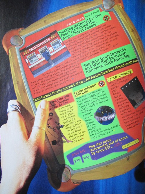
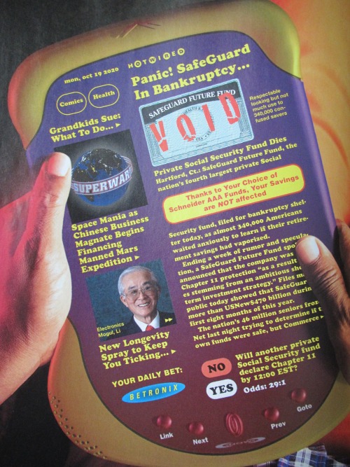
The article says "Industrial Design and Alias work by Lunar Design" and attributes photos to James Porto. I can't find too much information on this article, or in fact, the entire issue --it seems like the thing was made when Wired was still uneven about getting its material online. (and Amber's library resources came up blank as well.) The design work is pretty cool though -- with the exception of the "Porsche Cortex" they're not quite as grindingly minimalistic as the iPad. The Swatch one seems to be designed for bicycling, and the "SonyShack" device has a custom button for the wagering/betting that all the models support.
In trying to dig up information on this article I found a 1998 Digital Systems Research Center report on The Virtual Book, that reminded me the concept wasn't entirely new: the movie and novel 2001 had the "Newspad" (Commentators in February of 2010 loved pointing this "ripoff" out, making fun of the name 'iPad', and generally predicting it would be a big flop) and there was also Alan Kay's 1968 Dynabook concept - that link quotes an interesting exchange between Jobs and Kay.
http://twitpic.com/38t4pe "Multiplayer gaming in a nutshell." via
2007.03.25
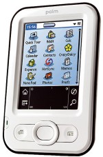 I took a small gamble and tried
Palm's $99 entry-level "Z22" and,
mirabile dictu, it is fantastic. Cheap and light, with a comfortably curved rear shell and the same UI that has been topped in the 10 years since the first Palms emerged... so good. The screen isn't as high quality as the old Sony, but Palm has never needed more than that basic 160x160. I have some other quibbles, the 4 way pointer thing isn't as useful as the Sony scrollwheel, and not as reliable as the up-and-down buttons on the old units, and I kind of miss having 4 application buttons, but still. I slapped on the included screen protector and don't worry about it not having a case or cover.
I took a small gamble and tried
Palm's $99 entry-level "Z22" and,
mirabile dictu, it is fantastic. Cheap and light, with a comfortably curved rear shell and the same UI that has been topped in the 10 years since the first Palms emerged... so good. The screen isn't as high quality as the old Sony, but Palm has never needed more than that basic 160x160. I have some other quibbles, the 4 way pointer thing isn't as useful as the Sony scrollwheel, and not as reliable as the up-and-down buttons on the old units, and I kind of miss having 4 application buttons, but still. I slapped on the included screen protector and don't worry about it not having a case or cover.
I'm almost surpised this came from Palm, whose design group seemed stuck on the idea that "compact" means flat but wide and long (so as to not sacrifice screen real estate, I guess, but disregarding the hand- and pocket-feel.)
I was surprised how long I was in that "looking for excuses to fiddle with it" zone with this gadget. Many well-designed devices will grab me like that for a bit, but I felt the compulsion for over a week, even with a decade of familiarity with the basics of it. Other folks dig the higher-end models, with wifi, or integrated phones, but this one is compact enough that I don't mind it as a standalone device, and cheap enough that I worry about it less.
(Weird... I just now noticed that the "SJ22", which I was happy with for a number of years, and "Z22" share that model number. And that number is 2 of the 3 digits of my lucky number 222. So maybe it's an omen!)
So, now I'm back to having... yeesh, a decade's worth of datebook, lots of notes, addresses, and my current Todo stack around with me at all times. It's not as important as when I was journaling on it instead of the web, but I dig it.
Passage of the Moment
[...]There was another bit of low-rent, half-assed psycho philosophy that I'd tacked on behind it somewhere along the line- sort of a corollary to "Deal with it"--namely, "Don't be a shit."He's been a columnist in some indy papers, a grizzled veteran of the school of hard knocks, suffering from a degenerative vision condition and all kinds of physical and karmic maladies.
This doesn't mean I became some sort of namby-pamby little Candide with a smile in my heart and a kind word for even the lowliest vermin. Hardly. But choosing not to be a shit just made sense. You want to get good service in a store, in a restaurant, or while dealing with a government agency? Then don't be a shit. Remember that in most cases, the people you're dealing with are under just as much stress and have just as many unspoken crises facing them as you do, so show a little patience--and tip well.
It sounds like he's a bit of a barfly, and the book reminds me how nice it can be to just sit in a bar and hang out in some quite and dark recess of a bar, especially with just 2 people.
The quote now reminds me of a "This American Life" piece yesterday that came to the conclusion that, for the most part, people tip what they always tip, regardless of the friendliness of the server. But if you can make life feel a little better for everyone involved, even if it's just the American faux-friendliness, why not?