2006.10.21
On the one hand, compared to, say, some people in my family, I'm pretty good, and sometimes my mom will trust me to help her navigate through a computer program or gadget that's new to both of us. And usually it's not too tough: figure out what the program does, figure out what information the program probably needs to do it, and then try to match what's onscreen UI-wise against those expectations.
But I'm easily misled, and dumb when some expectations (especially in labeling, or how controls are associated with other controls aren't met.) Here's an example:
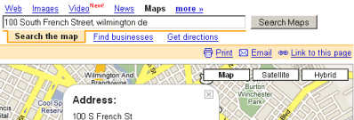
The other day I wanted to find a hotel near the Wilmington Train Station. My boss recommended Google maps, which I was of course familiar with... I looked up the address of the station and entered it:

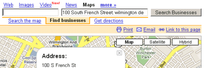
I think I figured out that I should click on "Find Business" easily enough, but for some reason this screen of interface stumped me:

As it turns out, it's easy enough, just enter "hotel" in the box on the left. But for some reason I Just Didn't Get It. It's like I needed the "near" prompt between the two textboxes, or something.
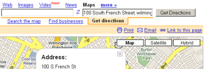
Maybe I was confused by how much it looked like the "Get Directions" symmetrical box pair, which I was more familiar with:

That, at least, has a little two-way-arrow icon (albeit a functional one that also swaps the start/finish locations).
But wait! I just realized that when I hit "Find Business" or "Get Directions", and then change the Map/Satellite/Hybrid view, there's a prompt ("What e.g., 'pizza'") that made it all obvious:

I gotta say, I think having that kind of "what to type" prompt appear when doing another arbitrary function (switch to Satellite view) and not when switching to that search is a definite UI bug on Google's part.
So anyway, Lately at work I've been experimenting with "load balancing" programs, software that will hit your website or application over and over and over. But I just feel like I'm the wrong guy for it sometimes, because I'm just not that gifted at picking up a new, not-well-documented or obscure UI in a hurry.
Musical Judgement of the Moment
I'm not anti-Phil Collins. I'm just pro-Peter Gabriel.I have no idea why I find this amusing.
