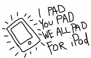
2010.04.12
It's... cool, but overrated.
As a laptop replacement, it's not quite there, except for very casual users. The trouble isn't the general browsing; that's a fairly superb experience. Once you get the feel of scrolling and zooming, it's awesome, suddenly you have a screen where the content on the screen can exactly reflect the focus of your mind and eyes.
But then I try to do some semi-advanced things, and run into problems. The iPhone has always annoyed me with its lack of a "ctrl-F" "find matches in page" feature. I can live with that on a handheld browser, but with something with the aspirations that the iPad has, it hurts.
There are more problems for people who are used to multi-tab browsing. I kind of like the thumbnail-based way of dealing with multiple "screens" (even though the iPad is pretty bad with frequently flushing other pages out of memory, so the pages have to have their content reloaded when you come back to them) but while there's a "Open in New Page" feature, there's no "Open in New Background Page" option. That means if you prefer to open interesting links in the background, and then come back to them when you're done with the current page, you have to have your finger ready to jump to the page manager and then hit your current page- hopefully quick enough to not have it lose your page. (Actually, even if you prefer to follow new content and then come back to what you started with, you're at risk for losing your place.)
Also, the lack of Flash hurts more than I expected. I don't really miss it on the iPhone, but on something trying to provide a total browsing experience I miss it.
(The Flash thing is even more interesting with the recent decision of Apple to not allow apps that are made in, say Flash or some other environment, and then have iPhone versions generated. I was full of outrage for a while, and it still seems kind of disgusting. I've read this explanation of it that makes the decision seem slightly less evil, that don't want half-assed multiplatform ports, they want to be the focus of developer's efforts, or nothing. (On the other hand, given how flooded the app store already is...)
The keyboard is so-so. You have to type with the fleshy part of your fingers for starters, and overall I find the layout of the iPhone keyboard more consistent - in particular, having the apostrophe be in a different "mode" is a bit frustrating.
Copy-and-Pasting isn't always consistently supported across apps, and like on the iPhone, sometimes the would-be-helpful "jump to paragraph boundaries" selection feature gets it wrong and it's tough to correct.
A few apps are buggy (Twitterific often loses its scrolling when messing with links embedded in a tweet, and I think I once saw something similar in Safari.)

(Maybe I'm just a weirdo in thinking that it's nice to draw in pixels and THEN shrink the image as the last anti-aliasing step; all I know is that when I try to flood fill or otherwise color in these apps, I tend to get kinda blurry messes. There is a chance that I'm thinking about this wrong, in a weird, Mid-90s "Microsoft Paint" kind of way and I should try to get fluent in some kind of vector drawing app instead.)
But even when I have an image I want to post, my options feel limited. Ideally I'd like to just use an Upload form - but with iPad Safari that's disabled -- I'm not really making files. Each app has its own database of my images, and then most will let me transfer it to the photogallery or email it, and one will let me tweet it and another will let me post to Flikr. Bummer! I have to jump through more hoops to get to what I want, but at least half the issue is trying to have more fun with a machine geared at consuming rather than making content. (I have some similar issues when I try to manually copy tweets into my personal blog thing.)
So that's it. In my final analysis, I'd say a netbook plus iPod touch is a better way of spending what an iPad costs. On the other hand, the iPad really does feel like the way of the future, and as more tablet options emerge, my issues with this kind of system might fade away.
(It's also kind of funny how it's not independent of having a real laptop or PC - when you fire it up out of the box refuses to have anything to do with you until you synch it up with iTunes, and woe be upon you if you hadn't previously upgraded iTunes...)
There are some other issues I didn't get into - it's nice that it can use the same conector cable, and its speakers are decent for music, but it would be nice if somehow you could use the same iPhone cradle some times of external speakers depend on.
Here's another review of being hands-on with the thing.
Do not fear mistakes, there are none.
First day, new job- Pearson Education. After a year of consulting-style gigs, so ready to really latch in.
Another thought to disturb slumber: For an octopus to imprison a human, all it would need is a gate with 3 doorknobs.
Punk rock was a conspiracy engineered by Gibson and Fender to convince people they didn't have to learn or practice music to buy gear.
